Social Networks are a Feature

Apple’s pre-announcement of Clips reminds me of Steve Jobs’s infamous quip to Dropbox CEO Drew Houston. From a 2011 Forbes feature:

Jobs smiled warmly as he told them he was going after their market. “He said we were a feature, not a product,” says Houston.

I’ve heard many dismiss Clips as too little, too late. A blatant attempt by Apple to weasel into the crowded market for quirky photo and video sharing apps. As a 41-year-old, I’m not sure I completely understand this field, but it appears to be dominated by Snapchat, while Facebook seems desperate to catch up and surpass them.

Where does that leave Apple? In punditry circles, the company is almost as well-known for their repeated failure to spark a fire in social networking as they are known for their successes in building highly desirable hardware and software products. Yes, products. Apple loves products, and is good at building them.

Despite constant criticism, Apple controls a pretty huge, relatively smooth-operating social network. The Apple ID single-sign-on infrastructure powers a host of social services including photo sharing, friend finding, document collaboration, shared calendars and reminders, and peripheral services such as Apple Pay that seem poised to make the leap to social when the company sees fit.

But “Apple ID” is not a catchy name for a social network, and despite its popularity among the Mac and iOS faithful, Apple makes little attempt to meaningfully bridge the gap with people who are tied into Facebook, Twitter, Snapchat, Weibo, whatever. These networks are enormously popular not only because users enjoy their features but because they are accessible from all popular hardware platforms. They facilitate interplatform friendship.

For a variety of reasons, the features afforded to Apple ID account-holders do not seem likely to attract non-Apple customers away from other social networks. So if Apple can’t beat ’em? Join ’em. Or rather, make it easy for Apple’s customers to participate at once in Apple-ID-powered services, and with outside social networks.

It started to appear that Apple had ceded “the social network” to other companies when they added standard share functionality to iOS and Mac. Virtually any text, image, or video on these platforms can be efficiently shared to Twitter, Facebook, Flickr, Tumblr, or any of an unlimited number of apps installed on the device that implement support for working with the media in question. If Apple had ambitions of becoming the dominant social network for sharing any of these types of content, they would probably not be so generous in facilitating this integration with their competitors.

I think Apple wisely considers their role, as the maker of personal computers and mobile devices, as empowering users to achieve specific goals in life. Apple empowers its users to write school papers, organize photos, record a jam session, check email, surf the web, work with a spreadsheet, play games, and yes, to connect with friends and family through a variety of social networks.

To this end, any time Apple might have spent building out their own social network is better spent investing in tools that maximize users’ enjoyment of the social networks they already belong to. Rather than obsessing over the venue in which social interactions occur, Apple can profit by equipping its users to be more expressive, wherever they may roam.

If I may stretch the venue metaphor for social networks, imagine you are invited to a huge gala event. Thousands of attendees are anticipated to meet up for an epic night of dining, drinking, and social revelry. Facebook, Snapchat, and Twitter are dying to rent the venue, cater the snacks, and serve the drinks. All things that set the tone for where, and how, people will interact. Apple is content to sell the suit, dress, or whatever, that empowers 30% of attendees to look and feel their best.

Clips falls naturally into Apple’s long history of software that is designed to enhance the creative productivity of its customers. GarageBand empowers users to share their musicality with anybody, on any platform, who can play an audio file. Photos and iMovie do the same for visual creative works. And now Clips, recognizing the unique appeal of combining film, photography, visual effects, text, and emoji overlays, seeks to do the very same thing with a twist on the format.

Few of us wake up every morning “excited to social network.” Yet we turn to services like Twitter, Facebook, and Snapchat to connect with friends and strangers. We’re excited to use the chat, image sharing, file transfer, and collaboration tools that add value to the stark, cold network. Many of these tools are built and shipped by the makers of the network, while others are supplied by third parties.

Apple’s Clips appears to be a canonical example of adding value to social networks from the outside. Regardless of whether you meet your friends on Facebook, Twitter, or a network that I have never heard of, Apple is glad to have you use and app like Clips to make your experience more fulfilling and fun. Clips is the latest of many products, from Apple and from others, that empowers you to express yourself uniquely. The social network you choose to do that on is merely a feature that connects you with friends and family.

Paper Airplane Icons

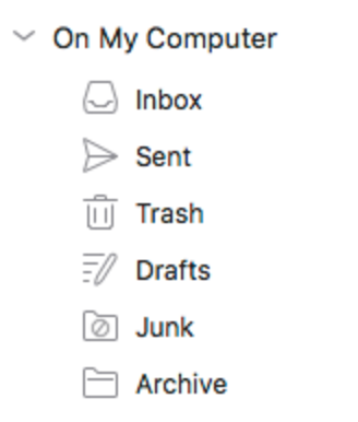
A friend who is running the latest beta of Microsoft’s Outlook 2016 for Mac shared a screenshot of the app’s sidebar icons:

PaperAirplane

The paper airplane used for “Sent” really jumped out at me, and I felt compelled to re-evaluate how common, and for how long, the metaphor has been used to represent a “sent email” in apps.

It seems obvious the metaphor is supposed to relate sending an email to the storybook notion of passing a note in class. Write your note on the paper, fold it into an airplane shape, launch it across the classroom, and hope against hope that you avoid the teacher’s gaze, aren’t ratted out by a classmate, and that you execute a perfect delivery so it doesn’t fall into the wrong hands.

Come to think of it, maybe this isn’t an icon that inspires confidence of a safe delivery. Nonetheless, I think it’s a pretty cute metaphor.

The app I most associate with paper airplane icons is the Mac’s built in Mail app. Apple uses a mix of metaphors in the app, including a postage stamp for the app’s main icon:

Apple Mail app icon.

and physical envelopes in the icons for some of its preferences:

Image of toolbar icons in Mail Preferences featuring physical envelopes

But when it comes to drafting and sending mail? It’s all about the planes. Notice how they even leverage the playful symbolism to represent a draft message with a paper folding diagram:

Image of Mail.app sidebar icons.

I was curious to know if another email app used paper airplanes to represent drafts before Apple Mail did. I went out Googling and found all manner of representations, usually employing the paper envelope, or another snail-mail related symbol. None of them, except Apple Mail, uses a paper airplane.

So my modest research suggests that the use of a paper airplane was a pretty novel bit of design. Was it an Apple innovation, or did it debut in some prior app I haven’t been able to track down? Is Microsoft’s adoption of the symbol the next step towards making paper airplane icons the universal symbol of sent mail? I kind of hope so!

Accessible Resistance

Accessibility in software refers to the noble ambition of ensuring that software is usable by as diverse a user base as possible. To that end, software is made more accessible by adapting to a variety of physical or cognitive impairments that may affect any individual user.

In the United States and other countries, there is an ugly trend towards supporting politicians who don’t believe that people from diverse backgrounds, or with specific impairments, should be accommodated by society as a whole.

Many developers are looking for concrete ways to fight these politicians who don’t value diversity and inclusion. One small thing we can all do to push back, to resist, is to ensure our own apps are as accessible as possible.

During my many years as an indie Mac developer, I have often prioritized accessibility in my apps. I have heard from many MarsEdit users, particularly those with vision difficulties, who tell me its accessibility makes it a better alternative to many other blogging solutions.

I am gratified to hear about the ways I have gotten accessibility right, but I am still not satisfied that I have done enough. There are nuances of MarsEdit’s accessibility that can yet be improved, while some of my other apps, such as Black Ink, are still hardly accessible at all.

If you are a Mac or iOS developer who is committed to improving the accessibility of your app, a great place to start is with the WWDC 2016 What’s New In Accessibility session. Apple is always enhancing the variety of accessible features that are built in to iOS, macOS, tvOS, and yes!, even watchOS.

Spend a half hour watching this video, and start getting up to speed with how you will enhance the accessibility of your app. No matter where you live in the world, you can be a strident voice for inclusion by declaring, through your actions in Xcode, that your software is designed to be used by everyone.

Progressive Disclosure In Swift

In his excellent interview with the Accidental Tech Podcast, Chris Lattner defended the goal of Swift being suitable to both beginner and advanced programmers. He cites progressive disclosure, a design philosophy that is often employed in GUI applications, to make otherwise intimidating interfaces appear approachable. From episode 205 of the show:

The secret to Swift in being easy to learn, easy to use as a teaching vehicle, but also powerful enough to solve the problems that need to be solved, is that the complexity in the language needs to be progressively disclosed.

This resonates particularly with me not only because I strive to make the same kinds of design tradeoffs in my own software, but because this concept is particularly important to the history of the Macintosh. Progressive disclosure as a user accommodation is intrinsic to most Mac and iOS interface design.

An example that anybody who uses a Mac can relate to is the process of deleting files by way of the Trash. There’s a file on your Desktop, and you want to get rid of it. A naive user who has never used a Mac before will soon learn how to drag the icon onto the trash, and how to empty it through a variety of discoverable UI buttons and menus. This is the Mac, it’s easy to use.

After gaining some experience the same user might start to find all that clicking and dragging tedious, so they’ll be delighted to learn that the cryptic symbols on commonly-used menu items represent keyboard shortcuts. To throw away a file and empty the trash, just select the file, press Cmd-Delete, and then Cmd-Shift-Delete. This is the Mac, it’s streamlined for productivity.

When the standard menu items and shortcuts don’t cut it anymore, the same user will be inspired by the variety of nuanced variations that are unlocked by holding the Option key while selecting menu items, and that the incorporation of the Option key into existing keyboard shortcuts often maps perfectly to the same menu item that appears when the key is held down. “Move to Trash” becomes “Delete Immediately,” and “Empty Trash…” becomes “Empty Trash”. The omission of the ellipsis, they have come to discover, indicates an action that will take place immediately, without additional interaction. This is the Mac, it’s kind of complicated, but great for power users.

Finally, finding cause to delete a variety of files from a directory selectively, based on pattern-matching, they discover the Terminal app. They teach themselves the basics of a decades old interactive shell scripting wildcard notation, and are off to the races invoking the “rm” tool with wild abandon. This is the Mac, it’s got god-awful, nasty interfaces for accomplishing just about anything.

I worked at Apple from around 1995 to 2002, so I had the pleasure of witnessing reaction both within and outside the company as we transitioned from Mac OS 9 to Mac OS X. The Terminal, as it happens, was one of the most contentious new features. Mac OS 9 had standalone command-line developer tools such as MPW (Macintosh Programmers Workshop), but it was a sort of point of pride that it didn’t ship with a Terminal app. This wasn’t DOS, for crying out loud! Many people complained that Mac OS X was too complicated, and that the inclusion of a Terminal app was the beginning of the end for the system’s famous usability.

Fifteen years later, people are still performing incredibly simple, incredibly complex tasks with macOS Sierra. It ships with a Terminal and it ships with a Trash icon. This is the Mac, it spans the spectrum from simplicity to complexity. Apple’s turns out to be pretty good at this, so they deserve the benefit of the doubt that they’ll achieve the same type of goal with Swift. It seems like they’re off to a good start.

Bitter iCloud Truth

A few days ago, I set about tidying up my completely unruly Contacts database. Over the years I have accumulated 2,953 distinct contact cards. Thousands are duplicates, hundreds were added automatically by Mail or macOS, some are for people whom I no longer know, and a very few are for folks I no longer want to know.

The first thing to do was obviously to take care of those duplicates. Contacts on the Mac features a couple seemingly handy menu items for dealing with this problem: “Look for Duplicates” and “Merge Selected Cards.” I cannot recommend using either of these features.

When I invoked “Look for Duplicates” on my 3000 cards, of which I could tell by visually scanning that at least 1000 were duplicates, Contacts came back at me with a stunningly unhelpful offer to fix 9 of them:

NiceTry

Seeing that I would have to identify the clones myself, I committed to selecting groups of two or three clearly duplicated identities, and selecting Card -> Merge Selected Cards. I generally trust Apple software to do the right thing, but recognizing the heartache that would come with losing any information from these cards, I decided to proactively export my Contacts database so that I would be safe should anything go wrong. Selecting File -> Export… -> Contacts Archive from the menu bar produced a 60MB bundle that seemed certain to contain all of the contact information on my Mac.

I tried “Merge Selected Cards” on a few items, and it seemed to do the trick. Where data from the two cards was identical, it merged them cleanly. Where something was in conflict, for example if a Company Name had changed from “Google” to “Apple” at some point, the conflict was resolved by picking one and appending the other to the merged card’s “Note”.

After painstakingly merging cards in this manner for an hour or so (!), I had stopped paying close attention to whether conflicting data was being persisted well or not. At one point I stumbled upon the realization that I lacked the phone number for a contact whom I had sent an SMS message just within the past week. Other contacts were missing key data, too. An outdated email address here, a missing mailing address there. Whoops! Abort mission! Time to recover from that backup file.

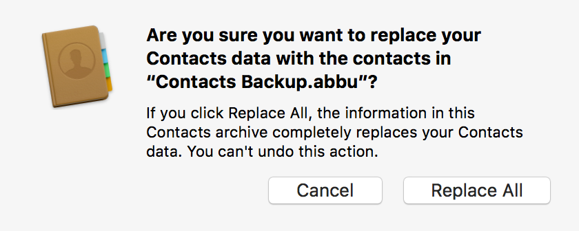
I double-clicked the backup file in the Finder, and agreed when Contacts asked if I was sure I wanted to “replace my Contacts data” with the contents of the archive.

Screenshot 1 3 17 1 14 PM

You’re damned right, I am sure! Give me back my data.

After restoring from Backup, I found that I didn’t have any duplicate entries in Contacts. In fact, I only had around 130 cards. Somehow I had lost the vast majority of cards in this process. What’s going on here?

I think what happened is that exporting from Contacts on my Mac is creating an archive that, when imported, possibly reflects the state of my Contacts database from years ago, before I ever agreed to sync Contacts with iCloud. No amount of futzing with local data on my Mac, including disabling iCloud syncing, and restoring the contents of Contacts’s data folder (~/Library/Application Support/AddressBook) would coerce Contacts into showing me all of my Contacts. I began to panic. Had I actually lost all of my Contacts data? In spite of dutifully backing up my local data and making a proactive archive from Contacts, the app had a very different idea of what my Contacts “truth” was.

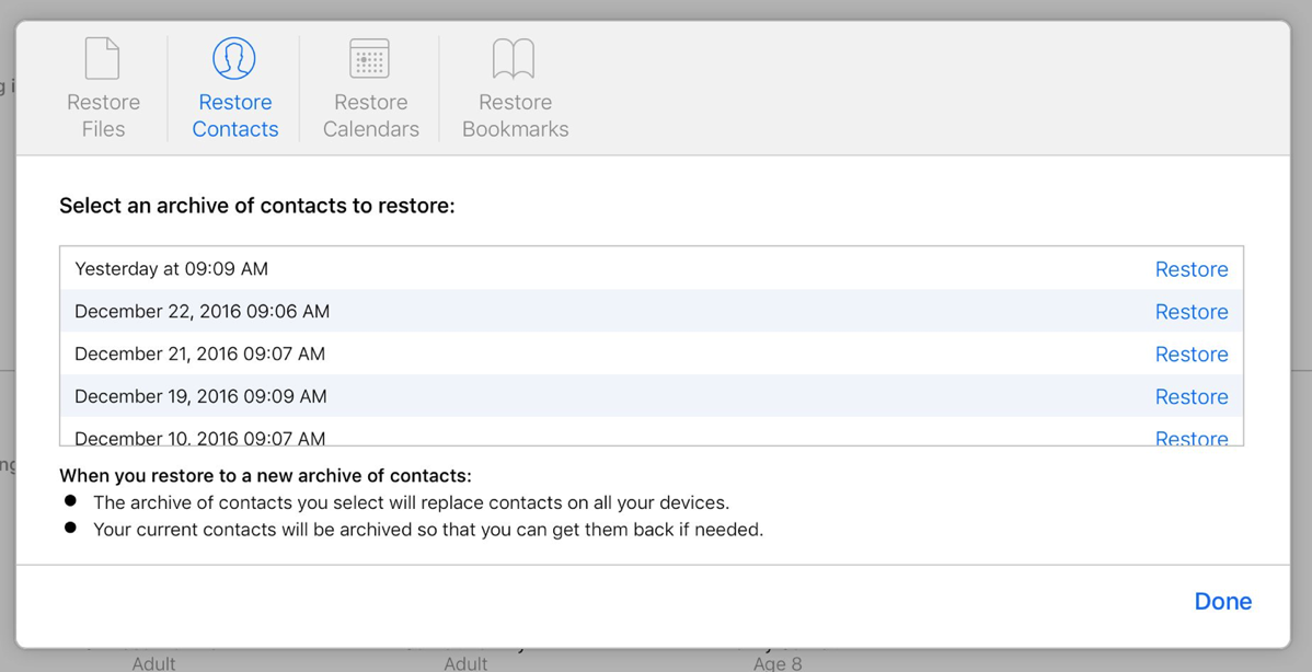
I was relieved to discover an iCloud.com feature for recovering Contacts to the state they were in on a previous date. You get to it by navigating to iCloud Settings -> Advanced, and clicking the “Restore Contacts” link.

NewImage

After restoring Contacts through iCloud.com, and syncing to iCloud from my Mac, my Contacts were finally restored to their absurdly broken, but data-intact, state.

The overarching lesson here is that when it comes to iCloud-synced data, you cannot count on local data, and worse: you can’t count on local archives. If you care to archive your data, navigate to iCloud.com and use the pertinent export feature from the web site. For example, from iCloud.com’s Contacts interface, click on a contact, then select “Select All”, and then “Export vCard…”.

ExportVcard

Amusingly, downloading this file will probably cause Contacts on your Mac to immediately attempt to import all of the contacts, which of course you will want to decline to do. Apple has a reference page, with detailed instructions for archiving various kinds of iCloud data.

The other lesson of course is you can’t trust Contacts to do a good or even acceptable job merging Contacts. I’ll be looking for another solution on this front. On Twitter, a f waller suggested Smart Merge Pro for iOS, but I tried that and it unfortunately is also blind to the duplicate nature of my cards! I guess something special is making my cards appear non-duplicated to both Contacts and this third-party app.

Update: I figured out why “Look for Duplicates” behaved so poorly: it wasn’t even considering my iCloud-based cards. So when I invoke it in Contacts on my Mac, it evaluates only the ~140 cards that are considered local to my Mac, and completely ignores the ~3000 cards that are synced via iCloud. Unfortunately there is no “Look for Duplicates” on iCloud.com, so what is a Mac-based user, for whom Smart Merge Pro doesn’t work, to do?

I think the way it works is it only considered “On my Mac” cards, if there are any local cards. If all your cards are iCloud based, then the “Look for Duplicates” command seems to work as expected.

Touch Bar Everywhere

Apple announced on Thursday that many of their new MacBook Pros will ship with a “Touch Bar,” a narrow, high resolution touch screen in place of the Mac keyboard’s traditional Function Key row.

Many people immediately wondered whether we can expect Apple to release an external keyboard with the Touch Bar. This would bring the technology to the much wider audience of Mac users who are not ready to update to the latest MacBooks, or who prefer desktop Macs, or who prefer the flexibility of using their MacBook in a desktop-style configuration.

The question was discussed on the latest Accidental Tech Podcast, in which, if memory serves, John Siracusa and Marco Arment argued different angles of the “no” argument, citing the hardware cost, the extent to which a Touch Bar keyboard would complicate the accessories lineup, and perhaps most significantly, that Tim Cook does not care enough about the Mac to prioritize pushing any such technology.

Casey Liss watched football. Zing! Actually, Casey pushed back against the cynicism, suggesting that Apple’s apparent lack of enthusiasm for the Mac does not reflect a lack of commitment to improving it. I, on the other hand, take exception with the very suggestion that Apple lacks enthusiasm or is not investing heavily in the Mac. Or, at least in this feature.

I think Apple intends to push the Touch Bar as as widely as it possibly can. The current MacBook Pro lineup is the most practical computer to debut the feature, but as it becomes possible to bundle it with external keyboards, and on notebook computers at every price point, they will do so.

Why am I so assured of Apple’s big plans for the Touch Bar? Because while many people assert that Apple is not investing seriously in the Mac, the Touch Bar’s hardware and software support appear to have been a major priority for the company in the year or two leading up to its release.

A massive amount of design work must have gone into the Touch Bar’s physical hardware, structuring the information it represents, and deciding how users will most usefully interact with it. I suspect that the Touch Bar merited an amount of design effort perhaps less than, but not completely incomparable to a standalone product like the Watch.

Thanks to the Touch Bar simulator in Xcode 8.1, we can also already take stock of the sheer amount of engineering effort, across many disparate groups in the company, that went into supporting the Touch Bar from a wide range of different apps and modes in macOS. Leave the simulator running while you go about your work, and prepare to be repeatedly surprised by the variety of novel use cases that have already been identified and implemented.

I find it impossible to believe that Apple would go to all this work, both on the Touch Bar itself, and across the entire range of its own apps and OS features, unless it had a grand vision for the Touch Bar that extends way beyond the internal keyboard of its premium notebook computers.

Instead, I think Apple sees the Touch Bar as a long-term, distinguishing aspect of using a Mac. Users will always be able to get by without one, just as they do for example when a multi-touch trackpad is not available. But macOS, and nearly every app that users run on it will work better with a Touch Bar. One day we’ll expect to always have access to one, and will feel that something is missing if we don’t.

It’s easy to see why Apple couldn’t come charging out of the gate with this vision fully realized. The Touch Bar hardware is no doubt expensive, and there are probably practical considerations with respect to the security of Touch ID, bandwidth between the device and the Mac, and managing its power needs in a user-friendly manner.

I say give Apple time. They’ve made a huge investment in Touch Bar, and all indications are they are prepared to continue prioritizing support for it down the road. We’re only on the brink of entering the early adopter phase, but in years to come I do think the Touch Bar will be everywhere.

The Price Of GPL

Matt Mullenweg, the founder of Automattic, downloaded his competitor Wix’s iOS app. It looked eerily familiar, and he confirmed it contains source code stolen from WordPress. He called them out on his blog, getting right to the point in addressing the problem:

Your app’s editor is built with stolen code, so your whole app is now in violation of the license.

Wix’s CEO, Avishai Abrahami, responded with a round of non-sequiturs that carefully evade the point that his product is built from source code for which they have not paid. One of his engineers equally misses the point, focusing on the circumstances surrounding the violation, rather than taking responsibility for the theft.

Some will take issue with the use of strong words like “stolen code,” and “theft,” with respect to a GPL violation. But that’s exactly what it is: software has been taken and deployed in Wix’s product, but the price for doing so has not been paid.

Many developers (and CEOs) seem to prefer remaining willfully oblivious to the consequences of using GPL code. They loosely interpret the terms of GPL to suit their own wishes for what they implied:

  • “It’s OK for us to use GPL code anywhere, as long as we contribute back changes.”
  • “It’s only a small amount of GPL code, so the license doesn’t apply.”
  • “We contributed to this GPL code, so we have special rights to use it.”
  • “We give back to the community in other ways, so it balances out.”

All false, yet all common interpretations of GPL, and echoes of the poor arguments presented by Wix’s CEO and engineer.

The price of GPL is fairly obvious and easy to understand, even if there is some bickering about what constitutes “linked code.” You don’t have to be a legal expert to get the gist of it: if you want to link your software with GPL code, you must also make your software’s source code available. Specifically, you must make your software’s source code available to customers who install your software, under a GPL-compatible license. You have to give your code away. That’s the price of GPL.

Many developers understand, and view the price of GPL as perfectly justified, while others (myself included) find it unacceptable. So what am I supposed to do? Not use any GPL source code at all in any of my proprietary products? Exactly. Because the price of GPL is too much for me, and I don’t steal source code.

Log Littering

Apple has dramatically revamped its standard logging mechanism. Unified Logging, available in macOS 10.12 and iOS 10, replaces various file-based logging approaches with a centralized, database-backed repository for log information of all levels of interest.

The big win, both for developers and for users, is performance. Where the simple act of logging some debugging information used to have enough of a cost to dissuade rampant use, the new system makes it so cheap that developers inside Apple and out are being encouraged to “log like the dickens” in the name of generating more evidence for posthumous debugging. The new system also offer impressive data mining abilities, making it far easier to filter for what you’re looking for and to track logging information across specific activities, even if the activity spans multiple processes.

The two big losses, in my opinion, are that the sheer size, number, and variety of logging messages makes it impractical for users to skim the console for “real problems,” and that the resulting logging archives are so large that it’s impractical to casually include them with bug reports to Apple or 3rd party developers.

The WWDC session on the topic goes into detail on these points, but perhaps most useful for framing my complaints here are Apple’s stated goals for the revamp:

  • One common, efficient logging mechanism for both user and kernel mode
  • Maximize information collected while minimizing observer effect [the phenomenon that enabling or adding logging changes the behavior of the system you are trying to understand]
  • We want as much logging on all the time as possible
  • Design privacy into the system

Two of the stated goals, “maximizing information collection,” and “as much logging on all the time as possible,” exacerbate the problems of there being so much log data that it’s both difficult to skim, and cumbersome to share.

Imagine a society in which all packaging has been transformed into fast-composting, biodegradable materials. Your soda bottles, snack wrappers, cigarette packages, etc., all biodegrade to dirt within 48 hours of use. What a boon for the world: the major, global problem of trash accumulating in our towns and environment would be gone. Poof!

Or would it? When “littering has no cost,” I suspect that we’d face a new problem: far more people would litter. Why bother finding a place to throw out that bottle, when nature will take care of it in within 48 hours? Multiply this attitude out over even a small portion of the world’s billions of people, and we’d be guaranteed to be buried in trash. All trash that will be gone in 48 hours, mind you, but constantly replenished with a fresh supply.

I think this metaphor points to a similar problem with unified logging: the sudden onslaught of “low cost logging” has left our developer society unprepared in some specific ways to deal with the consequences of the new reality.

So, how can we, and Apple fix this? We need specific solutions that make skimming for problems, and sharing pertinent log data easier, yet don’t impact the very positive goals outlined by Apple above. Here is my advice:

  1. Don’t litter the logs. Just because you can log it, and just because doing so is cheap, doesn’t mean there isn’t a cost. Some of the recurring log messages littering my Console arrive at a rate of thousands per minute. There may be good arguments that certain subsystems, in certain states, should log this extensively if the resulting data will justify easier diagnosis of problems, but much of the junk I see are redundant reiterations of relatively useless information:
Not switching as we're not in ~/Library/Keychains...
...
CSSM Exception:...
...
Etc. Etc. Etc.

Some of these seem to be well and truly noise, but some of them, even if they seem highly redundant and noisy to me, could in fact represent useful logging if you happened to, for example, be tracking down a subtle bug in Apple’s security libraries. That’s fine, I’ll accept that some amount of log diarrhea in the name of better software, but only if the following accommodation is made…

  • Annotate high-frequency logs for easier filtering. The logging system offers a variety of tools for annotating log messages, but even internal Apple groups do not seem to use these extensively or appropriately. The system supports the notion of three levels of log message: default, info, and debug. Only the “default” level messages are displayed by default in the Console app, yet all of the above-described garbage is displayed in that default mode. The Console will become significantly more useful when the worst offenders have marked their messages for severity, subsystem, and category so that they can be effectively omitted from the default view, and so that they can be mined later for use by folks who can actually make sense of them.

  • Generate context-specific sysdiagnoses. One of the worst practical outcomes of unified logging is that capturing a “sysdiagnose” on my Mac now generates a compressed archive that is still larger than 400MB. These archives are typically requested by most groups at Apple in response to bug reports, regardless of how severe the bug is or how readily reproducable it appears to be. In the world of Apple bug reports, sysdiagnoses are treated like lightweight bits of information that should be appended to every issue, except they’re now anything but lightweight.

    All the annotation work advised above should really pay off when Apple provides a streamlined mechanism for capturing sysdiagnose information pertinent to a specific subsystem or product. The company already offers product-specific advice for capturing log information, sometimes requiring the installation of custom profiles and other shenanigans. The lightweight unified logging system empowers Apple to both require that internal groups properly annotate their log messages and to facilitate smarter gathering of that data.

    Currently if you want to capture a sysdiagnose at any time a Mac, you simply press Ctrl-Opt-Cmd-Shift-Period. On an iOS device it’s done by holding both volume keys and the power key, but you have to enable logging first with a custom profile. This shortcut will generate one of those mondo 400MB style sysdiagnose archives, which you can upload to attach to your bug reports in your copious spare time.

    I envision a prompt that appears after invoking the existing shortcut, or else a new shortcut for “interactive sysdiagnose” where you could specify the category of bug you are reporting. The prompt would list categories correlating to groups at Apple who had done the work of providing streamlined log filtering data that will effectively strip out all the useless (to that group) noise from your log data.

    In fact, sysdiagnose already takes a “process” parameter when invoked from the command line, and my understanding is that this enables it to capture data that is pertinent to the target process. The unified logging system seems to provide the infrastructure for even smarter capturing along these lines.

    I realize that in this time of flux, where much log data is not properly annotated, there is still an incentive for many groups to capture as much as possible and sort it out on Apple’s end. These groups should know, however, that the larger the sysdiagnose archive you ask users to upload, the lower the chances they will bother actually following through on filing the bug or on providing the pertinent information you have requested.

  • Annotate specifically for user-concerning issues. Power users on the Mac have, for years, counted on being able to skim the console log for information that might explain a slow Mac, persistent crashes, or other inexplicable behavior. Given the huge increase in number of log message and the lackluster annotation of these messages by Apple, the Console app is effectively useless to users for this purpose.

    On top of getting the annotation right in general, I think a new special level of log message should be created, indicating particular concern to end-users. These would identify log messages that developers specifically think users should take notice of and follow up about. I mentioned there are three basic levels of log message: default, info, and debug. On top of that, there are two special levels called “fault” and “error”, which can be filtered on in the Console, and which receive special treatment from the logging system.

    These special levels seem close to what users might find interest in, but they’re not quite right either.

    A “user interest” level of logging message would facilitate the kind of high level skimming that seems impossible in Sierra today. These log messages would convey information that a user might gain some insight from. They would stand in stark contrast to the noise of messages like these, from the filecoordinationd process:

    Claim D32EDEBE-C702-4638-800C-E4BAB9B767F3 granted in server

    Nobody knows what a claim is, or cares whether it was “granted in server” … unless they are actively debugging filecoordinationd. On the other hand, a message indicating the failure to grant a claim “because the disk is full,” could be very useful to users indeed.

    I realize the line could be difficult to draw in some circumstances, but a huge number of messages currently being logged are obviously not of user interest. Perhaps then, the opposite approach could be taken, and log messages could be annotated as being specifically useful for posthumous, internal debugging by developers.

I tell you, things are bleak. We’re swimming in a morass of useless console noise, and there is little we can do about it. There is room for optimism however, as the logging infrastructure is good, and seems to support many thoughtful measures that could attenuate the problems and make the system more useful and less cumbersome to developers, end-users, and well-meaning bug reporters.

The console is littered with trash. Sure, it will biodegrade in 48 hours, but that doesn’t mean we shouldn’t be concerned with cleaning it up. A combination of more thoughtful logging, proper annotation, and appropriate filtering will get us out of this mess.

Twitter Optimism

Since its debut in 2006, Twitter has been free to use. As with so many other successful social networks, the strategy seems to have been to first attract a massive number of users, and then set to work figuring out how survive financially off of them.

After being conditioned over years to not pay a dime directly to the company, I don’t know that Twitter’s customers would have accepted a business plan that forced them to overtly pay for the service. Ads seem like a perfect fit, and we’re all so accustomed to trading our attention for free, or heavily subsidized services, that hardly any of us have complained.

Still, ads are obnoxious. They range from the merely obnoxious interruption of your personal timeline’s flow, graduate to the insidious obnoxiousness of ridiculous products you’re not interested in, and peak with the repulsive obnoxiousness of forcing the slogans of despised political candidates or other anathema concepts into your brain, by way of your ever-so valuable eyeballs.

What if Twitter adopted a business model that allowed them to maximize financial gain from advertising, while minimizing the obnoxious intrusion into the sanctity of your personal timeline? In fact, I think they could be on to just such a model.

On the latest episode of Core Intuition, Manton and I chatted about rumors that Twitter might soon be acquired by a larger company such as Salesforce, Google, or Disney. We agreed that each company would bring its own advantages, and threats, to the company. On the whole, though, we also agreed that Disney would be the best of the three with respect to maintaining the status quo.

Disney is a media company, through and through. Coincidentally, Twitter has aligned itself with media outlets over the years, offering high-profile integrations with major events ranging from awards shows, to sporting events, to political debates and beyond.

I suspect that as Twitter focuses more and more on these kinds of enhanced event-based Twitter streams, they will find that advertisers are keenly interested to pay a premium price for ads that target that same audience. Just as many companies will pay a massive amount of money to target the Super Bowl audience, they should expect to pay a significant markup to target the Twitter-based Super Bowl “moment.”

I’m optimistic that Twitter will recognize that the massive advertising potential of sponsored events leaves them free to leave boring, everyday social Twitter relatively, or completely ad-free. This approach would take will: it’s hard to say no to advertising dollars, and there will always be somebody willing to pay a few cents to pop and ad into Joe Public’s private Twitter feed. But selling out private timelines may be a poor investment, when Twitter could capitalize on the user trust and loyalty that will come from having their own “personal” spaces on the service treated with respect.

There are parallels in other media. For example, on television there are a few channels that are left unscathed by the blight of advertising. I don’t know whether it’s by force of Federal laws, local cable contracts, un-marketability, or some combination of the three, but for example you don’t see ads on local cable access stations or C-Span, do you? The cable industry chalks up these losses and nonetheless makes a healthy living selling ads on all the other stations that viewers inevitably opt in to watching, because they value the content.

I think Twitter’s users will continue to opt-in to their special events, because they value the content. And this self-selection is part of what makes the advertising opportunity so valuable. Finally, I don’t think users mind nearly so much when ads junk up the timeline of a public “moment,” because that content doesn’t feel, and isn’t meant to be personal. It’s mass media. We are used to advertising on our mass media, but tend to get really annoyed when it shows up on our personal chats and feeds.

Hopefully Twitter will recognize the opportunity they have to satisfy both their financial needs, and the wishes of their customers, by focusing their advertising where it really counts.

App Store Maturity

Apple announced that they will be taking steps to improve the quality of apps available in the App Store:

We are implementing an ongoing process of evaluating apps, removing apps that no longer function as intended, don’t follow current review guidelines, or are outdated.

Developers have known since early in the App Store’s history that Apple may retroactively decide that a particular app no longer merits inclusion in the store. Because of the large number of apps in the store, it has widely been thought that such reconsideration would only occur when and if a new version of an app is submitted, and thus reviewed again. This announcement, however, hints at a much larger-scale procedure, that would potentially cull thousands of products from the store.

Several months ago, developers noticed that the average review time for apps had dropped dramatically. Instead of taking several days, sometimes a week, or more, it is now common for apps to be reviewed in only one or two days. Many wondered whether some technical breakthrough made it easier to blaze through reviews. For example, improved static analysis, an automated fuzz-testing suite, or some combination of these and other techniques could reduce the need for stringent human involvement in some aspects of the review process.

There are over 2 million apps in the App Store, and Apple has effectively announced that they are prepared to re-review all of them in the name of improving overall quality in the store. This hints strongly that there has been some systematic improvement to the review process. It boggles the mind to imagine that all 2 million of those apps were in fact reviewed by humans, but that happened over the course of almost 10 years. Whatever process Apple is gearing up to apply, they claim apps will start dropping from the store as early as September 7.

It’s interesting to me that Apple feels comfortable dropping a potentially massive number of apps from the store. They have never shied away from boasting about the impact of the App Store, often focusing on the sheer size of it. They make a point in every WWDC keynote to talk about the vast numbers of developers, apps, downloads, and yes, dollars flowing through the store. Yes, if they measured success purely by number of apps in the store, they would have made their review criteria much more lenient from the start. But if they cut the number of apps for sale by a significant degree, it will be the first time in the App Store era that I remember the company emphasizing “quality, not quantity.”

I see both the decision to ratchet up quality control, and the willingness to live with the consequences of smaller bragging numbers in the store, as signs of the App Store’s maturity. When Apple debuted the iOS App Store, one of its main challenges was in justifying the very idea of an app store. Every enthusiastic update on the number of apps or amount of revenue generated by them seemed almost paranoiacally intent on proving the concept of the App Store correct.

Apple’s willingness to now intentionally deflate those metrics strikes me as a sign of cool confidence. The App Store concept has been proven valid. It was proven valid years ago, but Apple’s famous paranoia may not have allowed the defensive posture to relax until now. I’m optimistic that this change is only the first of many, in which Apple will focus less on arguing that the idea of an App Store is good enough, and more on the possibility that such an App Store can be insanely great. Hey, a guy can dream, right?

The Apple

MacRumors pointed out that Apple seems to be dropping “Store” from its store branding. The new flagship store in San Francisco, for example, is “Apple Union Square.” This has led to some criticism and guffawing from friends who now jokingly refer to any Apple Store as simply “The Apple.”

John Gruber thinks it makes sense to drop “Store” from branding, and compares Apple with other major brands whose stores do sound ridiculous with the appendage:

The “Store” branding only made sense when the concept was novel. Now that Apple’s stores are well established, it makes sense to drop the “Store”.

And:

No one goes to the Tiffany Store or Gucci Store, they just go to Tiffany or Gucci. It’s not even just a premium thing — you say Target and Walmart, not Target Store and Walmart Store.

The difference between these brands and Apple is that Apple’s identity has long been independent from the notion of a store. Calling it the “Apple Store” was not only important because the stores were a novelty, but because Apple is a brand that transcends retail. This may be true as well for Tiffany or Gucci, but when you think about these brands, I suspect you think of them in their retail context. Target and Walmart? They’re stores to the core of their being, so of course it would sounds strange to brand them as such.

Apple is a company whose products, hardware and software, have historically been sold separately from its own retail presence. Going to “Apple” will never make sense the way it does to go to “Target” or even to “Tiffany’s.” Where “Store” has been dropped, it’s essential that some other qualifier takes it place. Going to “Apple Union Square” makes sense. Asking a hotel concierge whether there is “an Apple nearby” makes as much sense as asking where the nearest “Ford” or “Honda” is.

Of course, the vast majority of people will probably still refer to any of Apple’s stores as “the iPhone store.”