Category Archives: Apple

The Nosiest Assistant

I bought a HomePod, and have been using it lightly for about a week now. On the face of it, I’m the ideal customer: an Apple fan who’s invested in other Apple devices, subscribes to Apple Music, is more-or-less at peace with Siri, and is primarily in the market for a better sounding home audio speaker. Hello, HomePod! I couldn’t resist.

I unboxed it and installed it in our dining room. I tested it with some of my favorite music, by Neutral Milk Hotel. It sounded fantastic to my ears, and seemed to live up to all the hype. My decision to put it in a common room was exciting for my children, who are six and nine. The six-year-old danced around, piping semi-naughty utterances such as “Hey Siri, play inappropriate music,” before giggling maniacally and looking to me for a reaction.

Next, we enjoyed about eight repetitions from the theme song for Milo Murphy’s Law, a children’s show starring Weird Al Yankovic. The kids fought over which one got to “ask Siri” to play it again next. For a short while, it looked as though HomePod would be a welcome addition in our home, but it soon wore out its welcome.

I expected shortcomings, as anybody who’s been following news about the device should, but none of the expected problems were deal-breakers. Here’s how many of those issues affect myself and my family:

  • Multiuser Support. It doesn’t support multiple users. It does support “personal requests” for exactly one user, so anybody who lives with family or roommates, and doesn’t want everybody to have access to their reminders, notes, etc., is compelled to turn off support for these requests.. Fortunately, Apple provides a setting for this and even asks during setup what the default should be. This is not a big deal to me, because I am almost always with my iPhone and Apple Watch, to which I make most of my “personal requests.” More on that later.
  • Multi-HomePod Support. It doesn’t support multiple HomePods. Yet. Apple promised technologically stunning audio performance with the HomePod, and they seem to have delivered. It’s supposed to be even better if you can afford to purchase two or more HomePods and let them work in concert (har, har) with one another. Me, I’m just looking for one HomePod to sound great in one room, so I’m not too bothered.
  • Direct Audio Input. HomePod can’t stream Bluetooth, you can’t plug an iPhone or any other USB device into it, and you certainly can’t pipe direct audio from RCA jacks or a headphone-style 3.5mm stereo jack. It can play music from your iTunes Music Library and Apple Music, or it can stream from an AirPlay-compatible device. This takes care of most my needs, but doesn’t cover all my wife’s wishes. We concluded we would need to keep our existing Bluetooth/USB playback device around as a backup plan.
  • Siri is Siri. Let’s face it: much of the criticism is warranted. I rely heavily upon Siri, and on the whole I’m pretty happy with it. Which is not to say I am not frequently frustrated by its mistaken interpretations and unfathomable inabilities. Perhaps the most embarrassing incompetency, particularly for a device that should feel at home in a kitchen, is its continuing inability to manage more than one timer concurrently. Chalk it up to Stockholm Syndrome, but I’ve got all manner of mental workarounds for Siri’s quirks. I get by, and I didn’t expect HomePod to make any of these challenges disappear.

What I didn’t expect was how incredibly sensitive Siri on the HomePod would be, and how obnoxiously persistent it would be about responding to my requests, no matter how far I am from the device, nor how unsuited it is for the task at hand.

My first experience with Siri’s obtrusiveness came while I was listening to loud music in my living room, being played by the HomePod in the dining room next door. I sat on the couch with my laptop, and paused to give myself a reminder about something. Let’s say it was “Hey Siri, remind me in 30 minutes to start making dinner.” I raised my Watch, issued the command, and was startled to hear the music suddenly drop to near silence. What’s going on? A moment later, Siri boomed from the next room:

You can turn personal requests on or off in the Home app associated with this HomePod.

Holy what! That was unexpected. An incredible demonstration of the perceptiveness of the HomePod, from a distance and over loud music, and a demonstration of the fundamental problem that is slowly driving me to disdain this thing: it will not stay out of my business! Any attempt to “Hey Siri” another device is met by a loud interruption by Siri either of the music, or of the silence of the room. It’s bad enough that it assumes all requests are being made to it, but it’s even worse that it insists on chiming in even when it isn’t capable of serving the request. Just to remind everybody that it’s not configured for personal requests. After several more unexpected activations, I conceded that things were not going well in the common room. I moved HomePod up to my office.

In my office, the HomePod is less useful as a music playback device, because I’m usually deep in thought on some programming or writing task, and I don’t do well with music playing in that context. However, at least in my office I could turn on “personal requests” and accept that HomePod might be my occasional fine-listening device, as well as a ubiquitous Siri assistant. At least it was worth a shot!

At this point I should mention that while my home office is primarily where I work on my independent software business, that I am also a moderately stressed out person who is trying to get a handle on reining in my busy, anxious-feeling brain. To that end, I commit some time in a typical workday to a very casual attempt at mindfulness meditation. I sit down on the floor, take a few deep breaths, close my eyes, and ask my Watch to “set a timer for six minutes” so I can unlock some personal decompression before getting on with my day.

You can guess where this is going: the first time I attempted to meditate in my office after moving the HomePod in, I had just settled down to lap up the water from the trough of relaxation when HomePod blares out at a loud volume: “Counting down from six minutes.” I value the timer on the Watch in part because it rouses me from my activity at first with a slight tapping and vibration on my wrist, rather than with a loud alarm sound. But as I had already settled down into my relaxation pose, I decided to soldier on, bracing myself for the room-shattering awakening that was soon to come.

At this point I’m on the verge of disabling “Hey Siri” altogether. Which is unfortunate because, to my mind, it’s still one of the most impressive features of the device. It’s just incredible to be able to utter music commands like “set volume to 30%”, “pause”, “continue”, “skip track”, etc., even at a whisper from across the room. If I disable this feature, I’m not sure I’ll find the merits of the HomePod as an audio speaker compelling enough to weave into my regular music listening habits.

I have filed a bug with Apple (Radar #37572955) requesting that it be less obtrusively interrupting, particularly when it can’t do what I’ve asked. Although I have high hopes for improvements to come with future software updates, you never can be sure when Apple will get around to fixing the issues that most vex you. I’m conflicted to be at once so impressed with the audio, form factor, and general behavior of Siri on the HomePod, while on the other hand having trouble finding a place in my house where it can show off all those features without also driving me and my family to frustration.

Update: After publishing the above, I received a note on Twitter from Connor asking what version of watchOS I am running:

I realized I didn’t know, off the top of my head. I figured I was updating my watchOS regularly, but couldn’t recall when I’d last done so. I reported that I was running watchOS 4.1, and he suggested that I might see an improvement after updating to 4.2.2. Yikes! I’d really fallen behind.

After updating to 4.2.2 I went back to my office and ran a few artificial tests. I immediately noticed the difference, as my Watch responded to “Hey Siri” requests, and the HomePod remained silent. I was so surprised that I wanted to confirm the HomePod was still listening. I lowered my Watch and issued a request, which was answered by HomePod. Moments later, I raised the Watch again and tried to address it, and this time the HomePod butted in again.

I think they’ve made dramatic improvements specifically to watchOS between 4.1 and 4.2.2, but there is still room for improvement. I had run into the problems with HomePod with my iPhone as well, which I confirmed is running the latest version of iOS. Still, the dramatic improvement with the Watch gives me hope that things will continue to improve, and the situation is not quite so dire as I had first experienced it.

Unified Swift Playgrounds

Usually I write about “programmer stuff” on Indie Stack, and “other tech stuff” here.

Today I had it in mind to write about my belief that Apple should get rid of Xcode Playgrounds and instead focus on adapting the iOS Swift Playgrounds app to the Mac.

I thought at first I would post it here because it’s not strictly about programming, but I ended up posting it there instead:

Unified Swift Playgrounds

May be of some interest even to folks not strictly interested in programming!

Sandbox Transparency

Apple’s sandboxing technology provides a mechanism for developers to specify “entitlements” that an app needs in order to provide functionality that users want. For example, on the Mac, an app can specify the entitlements to “print” and to “make network requests.” This system of granular privilege designation is a great baseline both for developers, to avoid accidentally overstepping intended bounds, and for users, to protect against apps intentionally or accidentally causing harm.

One of the biggest problems with Apple’s approach to sandboxing is that the accountability component has been left entirely to Apple itself. Developers are held accountable for the specific entitlements they request only when they distribute software through the iOS or Mac App Stores. In the review process, Apple may determine that a specific entitlement requested from an app is inappropriate for that app’s domain, and demand that the developer remove the entitlement before being approved. Or, in rare cases, they may approve an entitlement that other developers are not typically granted.

Yesterday, Gizmodo reported that Uber had been granted an entitlement for their iOS app that allowed them to capture an image of an iPhone’s screen at any time, even when the Uber app was not the active app on the phone. This is a big deal, because users don’t typically expect than an iPhone app that is not active might have the ability to eavesdrop on anything they are doing.

I have long felt that the sandboxing infrastructure on both iOS and Mac should be used to more accurately convey to users specifically what the apps they install are capable of doing. Currently the sandboxing system is used primarily to identify to Apple what a specific app’s privileges are. The requested entitlements are used to inform Apple’s decision to approve or reject an app, but the specific list of entitlements is not easily available to users, whose security is actually on the line.

I think the next step for sandboxing, on both iOS and the Mac, is to expose the list of entitlements that apps possess, in a way that is reasonably understandable to all users, and even more open to scrutiny by power users. Any user who is wary of an app should be able to examine its entitlements so that any unusual privileges can be evaluated. With this level of transparency, you can bet that Uber’s ability to arbitrarily record the screen would have been revealed much earlier.

Being more transparent with entitlements would also pave the way for overcoming an unfortunate side-effect of sandboxing: the elimination of whole classes of power-user level apps. If users were empowered to know what the privileges of an app are, through a combination of user prompting and an interface for inspecting entitlements, then it would be reasonable to grant more indulgent entitlements to developers.

Mac apps such as TextExpander essentially became unqualified for the Mac App Store with the advent of sandboxing, because they require access to system services such as monitoring the user’s keyboard input, in order to provide valuable macro text substitution. If entitlements were transparent across the board, and users were consistently informed about the extent of an application’s capabilities, it would empower users to make more reasonable decisions about the software they run. It would empower them to allow apps like TextExpander that are currently disallowed by the App Store’s sandboxing policies, and to reject apps like Uber that may be unexpectedly allowed to capture footage of users’ activity even while running other apps.

The Watch is a Phone

Since Apple announced that the Apple Watch Series 3 would be offered with an LTE option, a significant amount of collective energy has been spent scrutinizing the various pricing plans offered by telecom companies around the world.

Because I live in the United States I will focus on the de facto standard $10/month pricing that AT&T and Verizon have both announced. Depending on who you ask, this charge is either completely reasonable, or a complete rip-off. It may be a little of each.

Arguments for the rip-off point out that most US plans come with a fixed amount of data, and the extra $10/month doesn’t buy you any extra data. The charge is merely for the privilege of connecting directly to the provider’s wireless network from a Watch.

Arguments for reasonableness concede that there is an infrastructural cost to supporting another whole device on the network. Even if the data and phone number are shared, a new standalone device exists in the world, and it demands to be catered to by the network’s services.

I am not excited about LTE on my Watch, but I decided to buy an LTE edition anyway. Because Verizon is offering three months of free service as part of a sale promotion, I also decided I will give ubiquitous Watch connectivity a shot. Who knows? Maybe I’ll love it.

One thing that caught my eye during the checkout process was the fact that my Apple Watch has already been assigned a phone number of its own. Even though it will be configured in Verizon’s system to share my phone’s phone number, their process for activating and supporting devices on their network apparently requires assigning them a phone number. I don’t know if this is true of all carriers worldwide, or if this is a peculiarity of American systems, or of Verizon in particular.

In any case, I thought it was interesting that my Watch will have its own phone number, even if it goes unused. Longer term, I could see merit in configuring Watches to be the only device for a phone number. For example, a work phone at a company that communicates primarily by voice might be satisfied to equip their employees with a Watch and a pair of headphones.

I also think the fact my Watch will have its own phone number increases the justification for charging a nominal monthly fee. For as long as any Apple Watch is on Verizon’s network, a full-fledged US phone number will be “off the market,” so to speak. In most respects that matter to Verizon, the Apple Watch is not an add-on accessory to the iPhone that happens to want independent access to the network. The Watch is a phone.

Apple Watch Series 3

When Apple introduced the Apple Watch three years ago, orders were almost immediately backordered. Apple made a special offer to developers, granting us the opportunity to order a 42mm Sport edition with a blue strap, with minimal delay. I jumped at the chance and have been wearing the same “Series 0” ever since.

I’ve come to appreciate Apple Watch for all the ways it extends my iPhone: less intrusive notifications, casual Siri access, and effortless Apple Pay. I also appreciate the fitness monitoring, and have switched to using it as my exclusive running watch, in spite of its lack of GPS. It’s a pretty darned good debut product, and it has served me well.

That said, I dropped and cracked the screen over a year ago. With repair costs approaching the cost of replacement, I have long thought that I would hold out for the next big update before buying a new one. As I watched Apple introduce the Apple Watch Series 3 during their event last week, I knew that the time had come to upgrade.

Selecting a replacement has been more difficult than I expected. I always slightly regretted not getting the smaller, 38mm version of the watch, but I think I will err on the side of fat-fingered tappability and stick with 42mm. A harder decision has been choosing between the LTE Cellular version of the Watch, and the slightly cheaper WiFi/GPS-only model.

I thought it would be easy, because I don’t care about LTE. Or at least, I don’t think I do. Since I got in the habit of running with a belt, I’m accustomed to having my iPhone with me all the time. This ever-so-slight encumbrance has brought with it two unexpected benefits: I feel safer, knowing that I can always (in most locales) make an emergency phone call, and I feel empowered to take photos mid-run when something particularly interesting catches my eye. This has come in handy when jogging in foreign countries, through nature, or when I want to capture a selfie while running in a New England blizzard.

The LTE Watch certainly would provide the same emergency calling comfort, but am I willing to give up access to a camera for the freedom from wearing a running belt? I suspect not.

Nonetheless, I’ve decided to go for the LTE edition. Why? For one thing, apart from the option to add a cellular plan, the LTE models also feature twice the storage. I tend to err on the side of extra capacity, so even if LTE were not an option, I would probably choose to pay $70 for this alone.

Sweetening the deal, Apple offers configurations with the LTE models that are not available with the GPS version. After reading Serenity Caldwell’s iMore article about the merits of the Sport Loop, I’m convinced I’ll want to give this a try. Choosing the LTE model means I can preconfigure the Watch with it, instead of paying extra for the Sport Loop, and getting another rubber Sport Band that I’ll never use. (I’ve been loyal to the Nylon Band since they were introduced.)

In short, even if I never use the LTE functionality, the LTE model is the right choice for me. Who knows, maybe I’ll end up trying the cellular access, and it will be a big hit. Maybe I’ll cast my running belt aside, and not worry about lost photo-taking opportunities. Maybe LTE on my wrist will be a revelation, and I’ll laugh at myself for ever having doubted its usefulness. Maybe I’ll come around.

The only downside is that gaudy red crown.

Update: If you’re in the US and a Verizon customer, they’re offering to waive the activation fee and give 3 months of free service, but only if you buy the Apple Watch from them. Their site is a mess but you can get at most of the models here. Good news is their ship date for the model I chose is a few weeks ahead of Apple’s!

$40 Box Lunch

I’ve been hearing all about how the famously atrocious (though some beg to differ) box lunches served at WWDC for the past several years probably cost about $40 each. The discussion on the Accidental Tech Podcast is based on a 2010 article, cited by David Carlton on Twitter, in which the Game Developer Conference organizer Meggan Scavio explains that she would offer a $200 cheaper ticket for folks who wanted to opt out of lunch.

Conventional wisdom suggests that in venues like Moscone West, companies like Apple are forced to use the in-house caterers, and thus required to put up not only with the quality of the food that is offered, but with the price as well. I decided to do some shallow digging, and confirmed that Moscone West does in fact forbid exhibitors from bringing in their own food and drink. In fact the Catering FAQ for the exclusive caterer, Savor SMG, consists of just one question:

May we bring in our own food and beverage booth give-aways? i.e., espresso, candy bars, bottled water?

Savor SMG is the exclusive provider of all food and beverage for the Moscone Center and is pleased to be able to work with all requests. Please contact your Catering Exhibitor Sales Manager for all requests.

As for the price, is it really $40? Savor SMG’s 2017 menu confirms that the price is in the right ballpark. The “Executive Box Lunch” is $39.25 and sounds about like what I remember from WWDC:

Four compartment. Includes compostable service. 25 guest minimum.
Sandwich, wrap or entrée salad includes a choice of side salad, dessert and fruit.
To accompany your box lunches, we suggest adding assorted soft drinks and bottled water.

Soft drinks and water are not included. A 22% service fee, as well as sales tax (almost 10%), are also added to the price. So that $39.25 box lunch comes to around $52 before beverages. On Accidental Tech Podcast they suggested it was probably more than $40 by now, and it sounds like they are right.

Want to really lose your lunch? Each bottled water is $5.25, coming to $7.00 after service and taxes. And Marco’s long lost Strawberry C Monster Odwalla (“Assorted Juices”) would set Apple back around $8 a bottle. Add it all up and it’s not hard to imagine meals and snacks coming to $100 a day, or $500 for the week, per person. Nearly a third of the $1600 WWDC admission fee likely pays for food.

In San Jose, Apple will be free from the rigorous Moscone West catering restrictions, but will have to contend with another exclusive caterer in TeamSanJose. They also add a flat 22% service fee, as well as sales tax (8.75%). I don’t know how their box lunches compare, but the good news is the “Gourmet Box Lunch” comes in at only $22.00. “Mineral Waters, Soft Drinks, Juices and Bottled Water” are all a mere $4.50 each. These savings multiplied over 5000 or more staff and attendees should work out to a substantial savings for Apple.

Social Networks are a Feature

Apple’s pre-announcement of Clips reminds me of Steve Jobs’s infamous quip to Dropbox CEO Drew Houston. From a 2011 Forbes feature:

Jobs smiled warmly as he told them he was going after their market. “He said we were a feature, not a product,” says Houston.

I’ve heard many dismiss Clips as too little, too late. A blatant attempt by Apple to weasel into the crowded market for quirky photo and video sharing apps. As a 41-year-old, I’m not sure I completely understand this field, but it appears to be dominated by Snapchat, while Facebook seems desperate to catch up and surpass them.

Where does that leave Apple? In punditry circles, the company is almost as well-known for their repeated failure to spark a fire in social networking as they are known for their successes in building highly desirable hardware and software products. Yes, products. Apple loves products, and is good at building them.

Despite constant criticism, Apple controls a pretty huge, relatively smooth-operating social network. The Apple ID single-sign-on infrastructure powers a host of social services including photo sharing, friend finding, document collaboration, shared calendars and reminders, and peripheral services such as Apple Pay that seem poised to make the leap to social when the company sees fit.

But “Apple ID” is not a catchy name for a social network, and despite its popularity among the Mac and iOS faithful, Apple makes little attempt to meaningfully bridge the gap with people who are tied into Facebook, Twitter, Snapchat, Weibo, whatever. These networks are enormously popular not only because users enjoy their features but because they are accessible from all popular hardware platforms. They facilitate interplatform friendship.

For a variety of reasons, the features afforded to Apple ID account-holders do not seem likely to attract non-Apple customers away from other social networks. So if Apple can’t beat ’em? Join ’em. Or rather, make it easy for Apple’s customers to participate at once in Apple-ID-powered services, and with outside social networks.

It started to appear that Apple had ceded “the social network” to other companies when they added standard share functionality to iOS and Mac. Virtually any text, image, or video on these platforms can be efficiently shared to Twitter, Facebook, Flickr, Tumblr, or any of an unlimited number of apps installed on the device that implement support for working with the media in question. If Apple had ambitions of becoming the dominant social network for sharing any of these types of content, they would probably not be so generous in facilitating this integration with their competitors.

I think Apple wisely considers their role, as the maker of personal computers and mobile devices, as empowering users to achieve specific goals in life. Apple empowers its users to write school papers, organize photos, record a jam session, check email, surf the web, work with a spreadsheet, play games, and yes, to connect with friends and family through a variety of social networks.

To this end, any time Apple might have spent building out their own social network is better spent investing in tools that maximize users’ enjoyment of the social networks they already belong to. Rather than obsessing over the venue in which social interactions occur, Apple can profit by equipping its users to be more expressive, wherever they may roam.

If I may stretch the venue metaphor for social networks, imagine you are invited to a huge gala event. Thousands of attendees are anticipated to meet up for an epic night of dining, drinking, and social revelry. Facebook, Snapchat, and Twitter are dying to rent the venue, cater the snacks, and serve the drinks. All things that set the tone for where, and how, people will interact. Apple is content to sell the suit, dress, or whatever, that empowers 30% of attendees to look and feel their best.

Clips falls naturally into Apple’s long history of software that is designed to enhance the creative productivity of its customers. GarageBand empowers users to share their musicality with anybody, on any platform, who can play an audio file. Photos and iMovie do the same for visual creative works. And now Clips, recognizing the unique appeal of combining film, photography, visual effects, text, and emoji overlays, seeks to do the very same thing with a twist on the format.

Few of us wake up every morning “excited to social network.” Yet we turn to services like Twitter, Facebook, and Snapchat to connect with friends and strangers. We’re excited to use the chat, image sharing, file transfer, and collaboration tools that add value to the stark, cold network. Many of these tools are built and shipped by the makers of the network, while others are supplied by third parties.

Apple’s Clips appears to be a canonical example of adding value to social networks from the outside. Regardless of whether you meet your friends on Facebook, Twitter, or a network that I have never heard of, Apple is glad to have you use and app like Clips to make your experience more fulfilling and fun. Clips is the latest of many products, from Apple and from others, that empowers you to express yourself uniquely. The social network you choose to do that on is merely a feature that connects you with friends and family.

Paper Airplane Icons

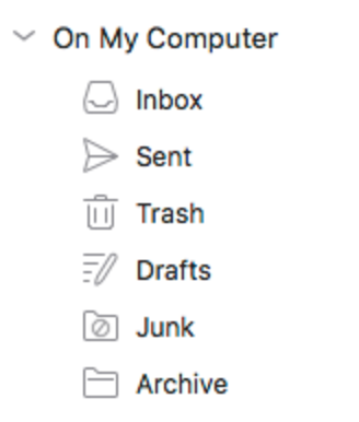
A friend who is running the latest beta of Microsoft’s Outlook 2016 for Mac shared a screenshot of the app’s sidebar icons:

PaperAirplane

The paper airplane used for “Sent” really jumped out at me, and I felt compelled to re-evaluate how common, and for how long, the metaphor has been used to represent a “sent email” in apps.

It seems obvious the metaphor is supposed to relate sending an email to the storybook notion of passing a note in class. Write your note on the paper, fold it into an airplane shape, launch it across the classroom, and hope against hope that you avoid the teacher’s gaze, aren’t ratted out by a classmate, and that you execute a perfect delivery so it doesn’t fall into the wrong hands.

Come to think of it, maybe this isn’t an icon that inspires confidence of a safe delivery. Nonetheless, I think it’s a pretty cute metaphor.

The app I most associate with paper airplane icons is the Mac’s built in Mail app. Apple uses a mix of metaphors in the app, including a postage stamp for the app’s main icon:

Apple Mail app icon.

and physical envelopes in the icons for some of its preferences:

Image of toolbar icons in Mail Preferences featuring physical envelopes

But when it comes to drafting and sending mail? It’s all about the planes. Notice how they even leverage the playful symbolism to represent a draft message with a paper folding diagram:

Image of Mail.app sidebar icons.

I was curious to know if another email app used paper airplanes to represent drafts before Apple Mail did. I went out Googling and found all manner of representations, usually employing the paper envelope, or another snail-mail related symbol. None of them, except Apple Mail, uses a paper airplane.

So my modest research suggests that the use of a paper airplane was a pretty novel bit of design. Was it an Apple innovation, or did it debut in some prior app I haven’t been able to track down? Is Microsoft’s adoption of the symbol the next step towards making paper airplane icons the universal symbol of sent mail? I kind of hope so!

Accessible Resistance

Accessibility in software refers to the noble ambition of ensuring that software is usable by as diverse a user base as possible. To that end, software is made more accessible by adapting to a variety of physical or cognitive impairments that may affect any individual user.

In the United States and other countries, there is an ugly trend towards supporting politicians who don’t believe that people from diverse backgrounds, or with specific impairments, should be accommodated by society as a whole.

Many developers are looking for concrete ways to fight these politicians who don’t value diversity and inclusion. One small thing we can all do to push back, to resist, is to ensure our own apps are as accessible as possible.

During my many years as an indie Mac developer, I have often prioritized accessibility in my apps. I have heard from many MarsEdit users, particularly those with vision difficulties, who tell me its accessibility makes it a better alternative to many other blogging solutions.

I am gratified to hear about the ways I have gotten accessibility right, but I am still not satisfied that I have done enough. There are nuances of MarsEdit’s accessibility that can yet be improved, while some of my other apps, such as Black Ink, are still hardly accessible at all.

If you are a Mac or iOS developer who is committed to improving the accessibility of your app, a great place to start is with the WWDC 2016 What’s New In Accessibility session. Apple is always enhancing the variety of accessible features that are built in to iOS, macOS, tvOS, and yes!, even watchOS.

Spend a half hour watching this video, and start getting up to speed with how you will enhance the accessibility of your app. No matter where you live in the world, you can be a strident voice for inclusion by declaring, through your actions in Xcode, that your software is designed to be used by everyone.

Progressive Disclosure In Swift

In his excellent interview with the Accidental Tech Podcast, Chris Lattner defended the goal of Swift being suitable to both beginner and advanced programmers. He cites progressive disclosure, a design philosophy that is often employed in GUI applications, to make otherwise intimidating interfaces appear approachable. From episode 205 of the show:

The secret to Swift in being easy to learn, easy to use as a teaching vehicle, but also powerful enough to solve the problems that need to be solved, is that the complexity in the language needs to be progressively disclosed.

This resonates particularly with me not only because I strive to make the same kinds of design tradeoffs in my own software, but because this concept is particularly important to the history of the Macintosh. Progressive disclosure as a user accommodation is intrinsic to most Mac and iOS interface design.

An example that anybody who uses a Mac can relate to is the process of deleting files by way of the Trash. There’s a file on your Desktop, and you want to get rid of it. A naive user who has never used a Mac before will soon learn how to drag the icon onto the trash, and how to empty it through a variety of discoverable UI buttons and menus. This is the Mac, it’s easy to use.

After gaining some experience the same user might start to find all that clicking and dragging tedious, so they’ll be delighted to learn that the cryptic symbols on commonly-used menu items represent keyboard shortcuts. To throw away a file and empty the trash, just select the file, press Cmd-Delete, and then Cmd-Shift-Delete. This is the Mac, it’s streamlined for productivity.

When the standard menu items and shortcuts don’t cut it anymore, the same user will be inspired by the variety of nuanced variations that are unlocked by holding the Option key while selecting menu items, and that the incorporation of the Option key into existing keyboard shortcuts often maps perfectly to the same menu item that appears when the key is held down. “Move to Trash” becomes “Delete Immediately,” and “Empty Trash…” becomes “Empty Trash”. The omission of the ellipsis, they have come to discover, indicates an action that will take place immediately, without additional interaction. This is the Mac, it’s kind of complicated, but great for power users.

Finally, finding cause to delete a variety of files from a directory selectively, based on pattern-matching, they discover the Terminal app. They teach themselves the basics of a decades old interactive shell scripting wildcard notation, and are off to the races invoking the “rm” tool with wild abandon. This is the Mac, it’s got god-awful, nasty interfaces for accomplishing just about anything.

I worked at Apple from around 1995 to 2002, so I had the pleasure of witnessing reaction both within and outside the company as we transitioned from Mac OS 9 to Mac OS X. The Terminal, as it happens, was one of the most contentious new features. Mac OS 9 had standalone command-line developer tools such as MPW (Macintosh Programmers Workshop), but it was a sort of point of pride that it didn’t ship with a Terminal app. This wasn’t DOS, for crying out loud! Many people complained that Mac OS X was too complicated, and that the inclusion of a Terminal app was the beginning of the end for the system’s famous usability.

Fifteen years later, people are still performing incredibly simple, incredibly complex tasks with macOS Sierra. It ships with a Terminal and it ships with a Trash icon. This is the Mac, it spans the spectrum from simplicity to complexity. Apple’s turns out to be pretty good at this, so they deserve the benefit of the doubt that they’ll achieve the same type of goal with Swift. It seems like they’re off to a good start.

Touch Bar Everywhere

Apple announced on Thursday that many of their new MacBook Pros will ship with a “Touch Bar,” a narrow, high resolution touch screen in place of the Mac keyboard’s traditional Function Key row.

Many people immediately wondered whether we can expect Apple to release an external keyboard with the Touch Bar. This would bring the technology to the much wider audience of Mac users who are not ready to update to the latest MacBooks, or who prefer desktop Macs, or who prefer the flexibility of using their MacBook in a desktop-style configuration.

The question was discussed on the latest Accidental Tech Podcast, in which, if memory serves, John Siracusa and Marco Arment argued different angles of the “no” argument, citing the hardware cost, the extent to which a Touch Bar keyboard would complicate the accessories lineup, and perhaps most significantly, that Tim Cook does not care enough about the Mac to prioritize pushing any such technology.

Casey Liss watched football. Zing! Actually, Casey pushed back against the cynicism, suggesting that Apple’s apparent lack of enthusiasm for the Mac does not reflect a lack of commitment to improving it. I, on the other hand, take exception with the very suggestion that Apple lacks enthusiasm or is not investing heavily in the Mac. Or, at least in this feature.

I think Apple intends to push the Touch Bar as as widely as it possibly can. The current MacBook Pro lineup is the most practical computer to debut the feature, but as it becomes possible to bundle it with external keyboards, and on notebook computers at every price point, they will do so.

Why am I so assured of Apple’s big plans for the Touch Bar? Because while many people assert that Apple is not investing seriously in the Mac, the Touch Bar’s hardware and software support appear to have been a major priority for the company in the year or two leading up to its release.

A massive amount of design work must have gone into the Touch Bar’s physical hardware, structuring the information it represents, and deciding how users will most usefully interact with it. I suspect that the Touch Bar merited an amount of design effort perhaps less than, but not completely incomparable to a standalone product like the Watch.

Thanks to the Touch Bar simulator in Xcode 8.1, we can also already take stock of the sheer amount of engineering effort, across many disparate groups in the company, that went into supporting the Touch Bar from a wide range of different apps and modes in macOS. Leave the simulator running while you go about your work, and prepare to be repeatedly surprised by the variety of novel use cases that have already been identified and implemented.

I find it impossible to believe that Apple would go to all this work, both on the Touch Bar itself, and across the entire range of its own apps and OS features, unless it had a grand vision for the Touch Bar that extends way beyond the internal keyboard of its premium notebook computers.

Instead, I think Apple sees the Touch Bar as a long-term, distinguishing aspect of using a Mac. Users will always be able to get by without one, just as they do for example when a multi-touch trackpad is not available. But macOS, and nearly every app that users run on it will work better with a Touch Bar. One day we’ll expect to always have access to one, and will feel that something is missing if we don’t.

It’s easy to see why Apple couldn’t come charging out of the gate with this vision fully realized. The Touch Bar hardware is no doubt expensive, and there are probably practical considerations with respect to the security of Touch ID, bandwidth between the device and the Mac, and managing its power needs in a user-friendly manner.

I say give Apple time. They’ve made a huge investment in Touch Bar, and all indications are they are prepared to continue prioritizing support for it down the road. We’re only on the brink of entering the early adopter phase, but in years to come I do think the Touch Bar will be everywhere.