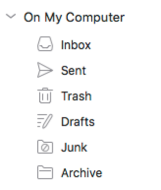
A friend who is running the latest beta of Microsoft’s Outlook 2016 for Mac shared a screenshot of the app’s sidebar icons:

The paper airplane used for “Sent” really jumped out at me, and I felt compelled to re-evaluate how common, and for how long, the metaphor has been used to represent a “sent email” in apps.
It seems obvious the metaphor is supposed to relate sending an email to the storybook notion of passing a note in class. Write your note on the paper, fold it into an airplane shape, launch it across the classroom, and hope against hope that you avoid the teacher’s gaze, aren’t ratted out by a classmate, and that you execute a perfect delivery so it doesn’t fall into the wrong hands.
Come to think of it, maybe this isn’t an icon that inspires confidence of a safe delivery. Nonetheless, I think it’s a pretty cute metaphor.
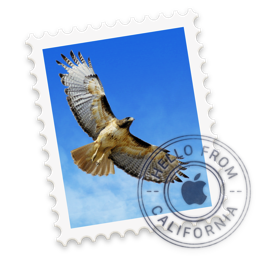
The app I most associate with paper airplane icons is the Mac’s built in Mail app. Apple uses a mix of metaphors in the app, including a postage stamp for the app’s main icon:

and physical envelopes in the icons for some of its preferences:
![]()
But when it comes to drafting and sending mail? It’s all about the planes. Notice how they even leverage the playful symbolism to represent a draft message with a paper folding diagram:
![]()
I was curious to know if another email app used paper airplanes to represent drafts before Apple Mail did. I went out Googling and found all manner of representations, usually employing the paper envelope, or another snail-mail related symbol. None of them, except Apple Mail, uses a paper airplane.
So my modest research suggests that the use of a paper airplane was a pretty novel bit of design. Was it an Apple innovation, or did it debut in some prior app I haven’t been able to track down? Is Microsoft’s adoption of the symbol the next step towards making paper airplane icons the universal symbol of sent mail? I kind of hope so!