Long-time Mac users will remember an app called “Key Caps”, which later become “Keyboard Viewer”, a feature of the Mac that is now accessible via the menu bar’s “Input Methods” item. If you’ve never played with this, I encourage you to enable it and check it out. Apple has detailed instructions for configuring the menu and these options.
I don’t use the Keyboard Viewer often, but when I do, it’s a real life-saver. I brought it up recently while I was debugging an issue with keyboard shortcuts in FastScripts, my scripting utility app. The Keyboard Viewer not only reflects every bona fide keystroke you make on a hardware keyboard, but also allows you to simulate keystrokes by tapping on the keys of the on-screen keyboard.
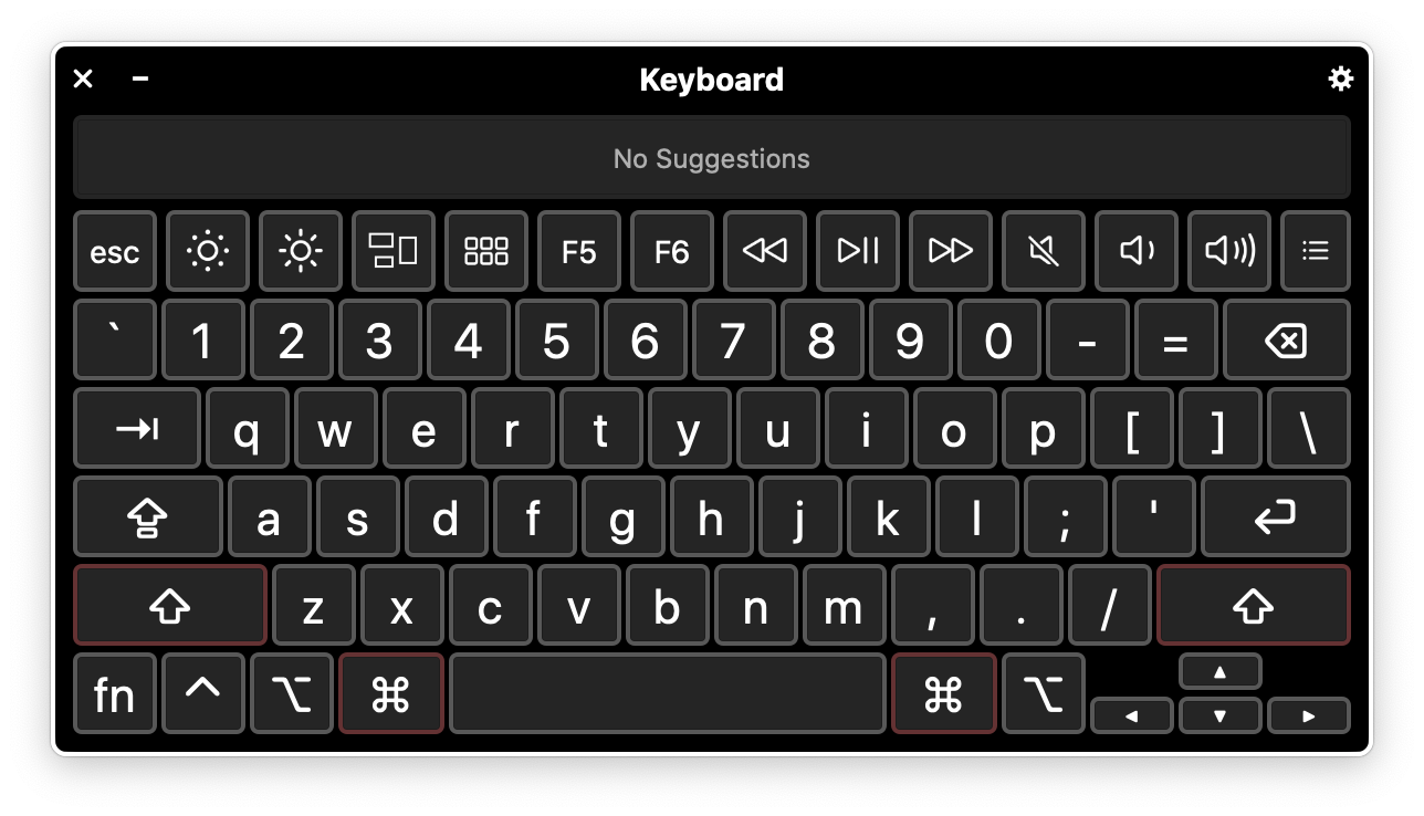
On macOS 10.15 Catalina, Apple has evidently dramatically overhauled the Keyboard Viewer. I don’t see any hint of this on the Apple marketing sheet for the OS, but this is what the Keyboard Viewer looks like on my Mac now:

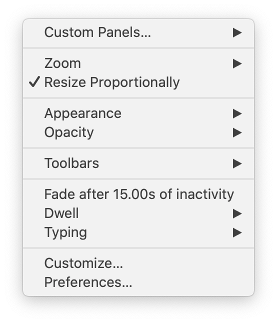
Well, isn’t that spiffy? But what I really want to talk about is that little Gear Button in the upper right corner of the window. Click it, and this what you get:

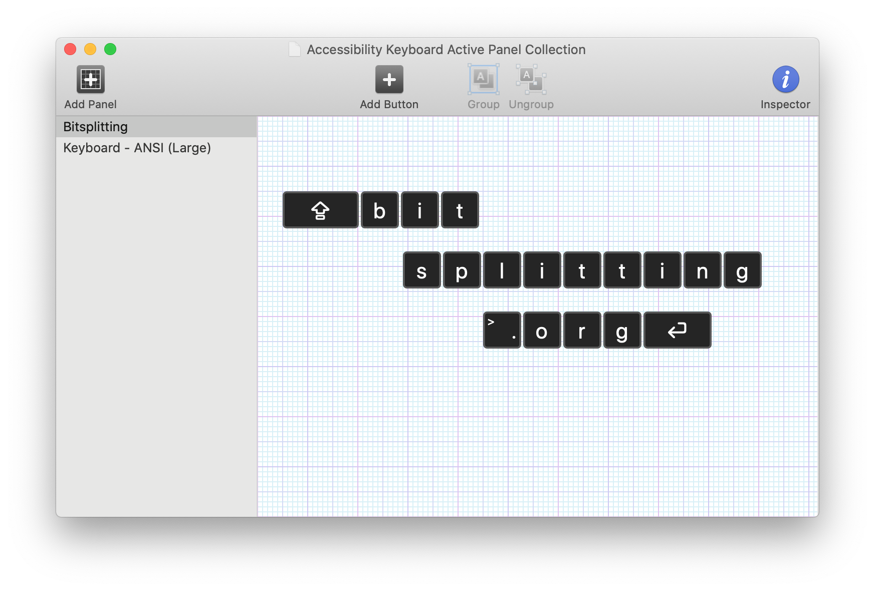
A whole slew of options for tweaking the behavior of the virtual keyboard, and an enticing “Customize…” item at the bottom. When you select it, a dedicated application called “Panel Editor” opens up. It’s essentialy a construction set for building virtual keyboard layouts:

This example is obviously comical, but the point is you can create and layout tappable regions that correspond to whatever keystrokes you desire. The options for configuring these keys even include options to perform multiple keystrokes, open apps, run scripts, etc. It’s a powerhouse of utility superpowers.
How did they possibly find time to add all this great functionality in one OS upgrade? They didn’t. Folks who are familiar with Apple’s Accessibility Keyboard have no-doubt recognized my screenshots as being familiar from past OS releases. I personally had never seen it before, but it’s been hiding in the System Preferences Accessibility tab. What happened in macOS 10.15 Catalina is that Apple has evidently recognized its superiority in all ways to “Keyboard Viewer” and allowed the Accessibility Keyboard to simply take its place.
This is an excellent example of software being designed to assist people with specific needs, yet actually being useful to everybody. That is the heart of accessible software design, and I think we’ll see more and more “accessible” software released from the relative obscurity of the Accessibility tab as we move forward.