Apple Intelligence

As WWDC draws near, anticipation of Apple’s long-rumored VR headset is high. The company is widely expected to announce an impressive, albeit expensive new product at the June 5 Keynote event. In short: people expect Apple to make a strong showing in this field.

People are justifiably less confident about Apple’s prospective plans in the area of artificial intelligence (AI), and particularly in the realm of large language models: the technology behind such imagination-captivating products as OpenAI’s ChatGPT, and GitHub Copilot (which itself uses another OpenAI language model).

I zeroed in on ChatGPT and Copilot because it’s easy to imagine the functionality of these services shining in the context of two important Apple products: Siri, and its Xcode developer tools. In fact, technology is advancing so quickly that the absence of something like ChatGPT and something like Copilot in these products seems likely to be viewed as major shortcoming in the near future, if it isn’t seen that way already.

The industry-wide excitement around AI is so great that it’s hard to imagine any company of Apple’s stature letting a major developer conference come an go without at least mentioning the technology, if not enumerating the specific ways in which they are using it in their products. Most people I know are confident it will be mentioned in the Keynote, but less confident that any news will be Earth-shattering, or even Earth-tickling.

Which leads me to my somewhat far-fetched prediction for WWDC: Apple will talk about AI, but they won’t once utter the letters “AI”. They will allude to a major new initiative, under way for years within the company. The benefits of this project will make it obvious that it is meant to serve as an answer to comparable efforts being made by OpenAI, Microsoft, Google, and Facebook. During the crescendo to announcing its name, the letters “A” and “I” will be on all of our lips, and then they’ll drop the proverbial mic: “We’re calling it Apple Intelligence.” Get it?

Apple often follows the herd in terms of what they focus their efforts on, but rarely fall into line using the same tired jargon as the rest of the industry. Apple Intelligence will allow Apple to make it crystal clear to the entire world that they’re taking “AI” seriously, without stooping to the level of treating it as a commodity technology. They do this kind of thing all the time with names like AirPort, AirPlay, and AirTags. These marketing terms represent underlying technologies that Apple embraces and extends. Giving them unique names makes them easier to sell, but also gives Apple freedom to blur the lines on exactly what the technology should or shouldn’t be capable of.

Apple Intelligence won’t be as good as ChatGPT or GitHub Copilot, at least not to start with. But it will be Apple’s. They can frame the pros and cons however they see fit, working their typical marketing magic to make its shortcomings seem less important, if not downright advantageous. And, being an abstraction on the already broad subject of “AI”, they can evolve its capabilities over time, gradually improving on it and increasing its brand recognition. In five years, when every other company is still talking about “AI”, or whatever other buzzword has taken its place, Apple may well have already incorporated the technology into its own A.I.

52 Floppy Pickup

On the latest Accidental Tech Podcast, John reminisced about the early days of the Mac, when a single 3.5″ floppy disk drive was typically used not only to boot a Mac, but also to run any applications, and to save any user data. He described the painstaking process of needing to insert a different disk whenever programs required access to specific executable code or data. Depending on the complexity of a workflow, you might be prompted to swap disks once, twice, or potentially dozens of times.

The conversation reminded me of one of my first jobs at Apple. I was hired to work as a QA tester with the engineering team that shipped Mac OS system software updates. The first release I worked on was Mac OS 7.5, which was released in 1994. By this time hard drives had become commonplace and the kind of floppy-swapping John described had become a lot less common for most users. But when it came to installing new software onto a Mac, some amount of removable media juggling was usually required.

Typically at that time, major OS updates were installed from CD-ROM discs. The system used the same basic strategy: it would eject one disc and prompt you to insert another, until the installation process was completed. It was a little tedious, but because CD-ROM discs had a massively higher capacity than floppy disks, it usually only required a few swaps.

One day during the lead up to finishing System 7.5, my boss brought a massive box full of floppy disks into the lab I worked in. The System 7.5 update was remarkably backward compatible, and supported computers as old as the Macintosh Plus and SE, which did not include a CD-ROM drive. In fact they did not even support the relatively higher density 1.4MB floppy disks of the era. That massive box was the System 7.5 installer, split across 50 or so (as best as I can recall) 800K floppy disks. I was supposed to make sure it worked.

Another thing John recalled on the show was how some folks got amazingly good at floppy-swapping process, developing a muscle memory for fluidly withdrawing and inserting disks on command. Suffice to say, after testing that 50-floppy install process more than a couple times, my muscle memory was pretty darned good.

Spelunking Apple’s Open Source

Since the earliest days of Mac OS X, Apple has complied with the licenses for the dozens of open source components it includes in the OS by posting (sometimes a little belatedly) updated versions of the source code to its Open Source at Apple web page.

This resource is useful primarily to developers, but may also interest curious technophiles who want to take a peek “behind the curtain” to see how much of the magic just beneath our fingertips is made.

If you visit the page today, you’ll see a new emphasis on Apple’s high-level projects, such as Swift and WebKit. At first glance you might wonder if the extensive list of all the open source projects has been removed from the site.

There’s no need to worry: the whole list, indexed by the pertinent platform and OS release to which they belong, is still available on a separate Releases page. Even better, each of these releases now has a corresponding GitHub repository, hosted in a dedicated organization reserved exclusively for open source distributions.

As great as the old list of distributions by release is, it can be tedious to pinpoint exactly where a particular component’s source code might live. Sometimes it’s easy: for example, the source code for the version of the Vim editor that shipped with macOS 13 is conveniently located in a distribution called vim-136. But other tools can be harder to find. If you were curious about the “banner” command, which was historically used to generate ASCII text suitable for printing huge messages at dot matrix printers (!), and which is remarkably still available as a built-in command on every Mac, you’d have to know to go looking for it in the text_cmds-138 release.

Apple’s decision to host these releases on GitHub, under a distinct organization, solves the problem. If you want to find the source code to an arcane tool like “banner”, just type it into a GitHub search of the organization. If there are too many false hits, as is the case for a common word like banner, try searching on something unique like a term from the command’s man page. The banner tool is credited as being authored by Mark Horton, and a search for “org:apple-oss-distributions Mark Horton” brings up more hits than I would have guessed (he also contributed to vim and vi, coincidentally), but a reference to the banner man page is the second search result.

I was inspired to write this blog post by a situation that came up in a programming Slack, where one person asked for “an API that could list the open ports and their owning processes.” Another replied that the command-line tool “lsof” is up to the task, only the person wasn’t looking for a command-line tool. Using the knowledge of Apple’s open source distributions, you could go look for, and find, the pertinent source code, and determine which API it was using.

When questions like these come up, many times the answer comes from a wise old sage who happens to know exactly what you’re looking for. Other times, Apple’s increasingly well-indexed open source distributions might be just the ticket.

Disciplined Innovation

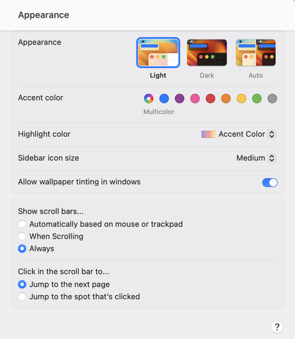
Apple’s macOS 13 “Ventura” beta features a major redesign of the System Preferences application. In addition to renaming it “System Settings,” Apple revamped the interface with an organization style that is far more reminiscent of the iOS “table view” organization than of the macOS status quo:

Screenshot of the macOS 13 Ventura System Settings Appearance tab

At first blush, there are apparent advantages to this design. Perhaps most significantly, the resemblance to iOS in both appearance and function may make the interface more navigable, and easier to understand, for users who are more familiar with iOS than with the Mac. The familiar “stack based” approach to delving deeper into the details of a particular preference pane has some advantages to the typical Mac approach of presenting detail as modal panels, which sometimes beg to be awkwardly nested in a pile of secondary or tertiary panels.

On second, third, and many blushes beyond, however, the design of System Settings appears to represent a major regression in overall usability and aesthetics. It has been taking public jabs since the first deveoloper beta, prompting a challenging question from John Gruber in his interview with Apple’s Greg Joswiak and Craig Federighi. Federighi replied with a compelling argument in favor of unifying the design experience across platforms, and removing historic cruft from the legacy macOS designs. Federighi further complained that Apple was being “judged for its betas,” implying that the UI would see significant improvements over the course of the summer.

We have seen improvements, but by the judgement of most Mac faithful (or at least the loudest among them), these improvements are not enough. Recently, a trending Twitter thread by Niki Tonsky reignited criticism, while many people pointed out that as the expected ship date for macOS Ventura draws closer, we are less likely to see dramatic improvements.

John Gruber returned to the subject in a piece yesterday, in which he asserts “the basic fit and finish of Ventura’s new System Settings is just bad.” He lays much of the blame for this on SwiftUI, which he further asserts that with SwiftUI “so many little layout details are apparently hard to get right.”

I have heard several people acknowledge that the successful transition to Apple Silicon was accomplished in part by focusing on the underlying architectural change while having the discipline to keep the hardware the same. The thinking is that with such a dramatic change in the underlying technology of the Mac, it would have been reckless to attempt other major hardware changes at the same time. In short: the Apple Silicon transition can be judged as successful on the basis that anybody using such a Mac might not even know they were using a fundamentally different computer design.

With Apple Silicon, Apple was able pull the proverbial table cloth out from under the exquisite place settings of the Mac, comprising its beloved hardware and software features, while leaving everything standing exactly as it was. That’s quite an achievement.

I think that SwiftUI would be judged as a more successful transition if Apple had pulled off a similar stunt. What if they had approached the challenge by making sure, first and foremost, that every Mac and iOS UI component behaved exactly the same as before? Then, as with the Apple Silicon changes, they could leverage the advantages of the new technhology to expand and improve upon the status quo, rather than attempting to replace it.

By choosing to change the underlying technology while also introducing new UI designs and behaviors, Apple has effectively attempted to pull the tablecloth out from under the place settings, while also pouring tea, cutting the cake, and serving the sandwiches. Messes will get made, some dishes are bound to get broken, and they’ll take a long time to put back together.

Dump FogBugz

Once upon a time, there was a fabulous service called FogBugz. Well, technically it still exists, but over the past many years, since it was sold off by Fog Creek Software, it has both stagnated and diminished in reliability as a substantial number of us long-time users has grudgingly continued to use it.

Several months ago, the whiff of abandonment became too great for me to bear any longer, so I devised a plan to migrate my data out of FogBugz, and into more reliably maintained services. FogBugz effectively served as both a customer-service database, and a bug-tracking system. Most apps don’t strive to achieve this, so I had to plan for two new services to fill the shoes of this app. I settled on HelpScout for customer service, and GitHub Issues for bug-tracking. HelpScout has turned out to be more of a solid home run than GitHub issues, but I’m happy with both.

Whether you’re also looking to transition away from FogBugz, or just want a reliable means of backing up your data, you’ll need to use the FogBugz API to get your data out. Once you have a structured backup of all your case data and attachments, you’ll be in a good position to evaluate how you might migrate that data into a format that is suitable for importing to another service.

I’ve shared a pair of simple Python scripts on GitHub that will help you to automate dumping your FogBugz data. Simply download my dumpbugz files from GitHub, follow the directions in the README, and you should be left with a “Cases” folder that includes all of your data and attachments.

For my transition to HelpScout and GitHub Issues, I wrote additional scripts to interface with the APIs of those services. Those are not ready for sharing at this point, but I may share them in the future. In any case, I hope the scripts make it easier for you to “Dump FogBugz” sooner than later.

Purgeable Mac Apps

For months now, I have been scratching my head over a small but persistent number of “crash reports” affecting a few of my apps. The issue is most prevalent in MarsEdit, where I have a handful of users who run into the issue multiple times per day. Luckily, one of these users is my good friend and colleague, Manton Reece. I’ve been peppering him with questions about the issue for weeks, while he stoicly puts up with the behavior.

Even with the assistance of a highly technical friend who can reproduce the issue at will, I had thrown my arms up in despair several times. I put “crash reports” in quotes above, because although my in-app crash reporter notices the app abruptly terminates, the system doesn’t create any obvious artifacts. No crash or hang reports. No “Quit Unexpectedly” dialog. The app is just … gone. I wrote a question in the Apple Developer Forums, which turned into a kind of de facto diary as I pursued the issue.

When I started to feel bad about asking Manton to try this, that, and the other thing, I finally asked if he could send me a “sysdiagnose” report. If you’re curious, the easiest way to grab one of these on any Mac is to simply press the Control, Option, Command, Shift, and “.” (period) keys at once. You’ll see the screen flash, an indication the system is starting to collect the reports. A few minutes later the report will be revealed in the Finder: a probably quite large zip archive. Open it up and see the wealth of information about nearly every aspect of the system.

Yet even with this wealth of information, I was stymied. It wasn’t until I chanced upon the delightfully pertinent nuggets of information in “/var/log/com.apple.xpc.launchd/launchd.log” that I got my first whiff of a clue:

2022-05-03 09:15:22.088718 (gui/501/application.com.red-sweater.marsedit4.384452971.384452977 [13840]) : exited with exit reason (namespace: 15 code: 0xbaddd15c) - OS_REASON_RUNNINGBOARD | <RBSTerminateContext| code:0xBADDD15C explanation:CacheDeleteAppContainerCaches requesting termination assertion for com.red-sweater.marsedit4

Here we have a message asserting that MarsEdit was terminated, on purpose, and better still, it includes an explanation! As far as explanations go, “CacheDeleteAppContainerCaches” is not much of one, but it did give me something to go on. Searching for the term yielded pertinent results like this post about Apple Mail and Safari “suddenly quitting.” Unfortunately, they all seem to be scratching their heads as much as I am.

The other thing that jumped out at me from the log was the term “OS_REASON_RUNNINGBOARD”. Searching for this results in only a few scant links, all related to Apple’s open source Darwin kernel. However, Searching instead for just “RunnningBoard” offered a glimmer of hope. A post on Howard Oakley’s blog, “RunningBoard: a new subsystem in Catalina to detect errors“, includes a particularly succinct description of the eponymous OS subsystem (emphasis mine):

Catalina brings several new internal features, a few of which have been documented, but others seem to have slipped past silently. Among the latter is an active subsystem to replace an old service assertiond, which can cause apps to unexpectedly terminate – to you and me, crash – in both macOS 10.15 and iOS 13: RunningBoard.

Unexpected termination. Yep. To you and me? Crashing. At this point in the story I’m going to elide several hours of long, tedious, and yet still somehow fun work, wherein I disabled System Integrity Protection on my Mac, so that I could attach to the pertitent system daemons and try to make sense of how, and when, they might decide to unilaterally terminate an app like MarsEdit. While digging deeper into the issue, I remembered that “explanation” from the log, CacheDeleteAppContainerCaches, and it reminded me of system maintenance software like CleanMyMac. I normally shy away from these kinds of apps because they are historically known to be overly-aggressive in what they decide to delete. In the name of science, however, I decided to run it, with care, on my Mac.

Boom! After running CleanMyMac once, MarsEdit, along with Numbers, were suddenly not running anymore. I had finally reproduced the issue on my own Mac for the first time. Anybody who has fixed software bugs, either for a living or as a passion, knows this is the critical first step to really addressing an issue. With some tinkering, I was able to narrow down the reproduction steps to running the “Free Up Purgeable Space” action. It turns out this is invokes a system API responsible for trying to delete caches, etc., from a Mac. Normally the system only does this when disk space is critically low, but CleanMyMac gives you the option to exercise the behavior at any time.

That single log line quoted above turns out to hold another gem of information. The “code:0xBADDD15C” looks like it could be an arbitrary hexadecimal value, but it’s an example of an error code designed to both uniquely identify and suggest a mnemonic clue to the underlying issue. Apple documents many of these codes, which include 0xc00010ff (cool off), 0xdead10cc (deadlock), and 0xbaadca11 (bad call). I searched the system frameworks for this code and found it in the disassembly of “/System/Library/PrivateFrameworks/CacheDelete.framework”. Particularly, in an internal function called “assert_group_cache_deletion”. It was only after exploring the issue in the forums, did Quinn explain that the code in this scenario is a mnemonic for “bad disk”. I guess it was easier to spell out than trying to represent “full disk”.

Equipped with all this new information, what can we do about the unexpected terminations? Well, nothing. I do wish Apple’s framework would try asking nicely if the app would quit, before summarily terminating it, but I guess the thinking is that this functionality should typically only be reached in extenuating circumstances. After learning more about the issue, I confirmed with Manton that his Mac did have low disk space, so I guess it was just the system trying its best to free up space that caused the issue for him.

The one thing I plan and hope to do as followup is to amend my built-in crash reporter so that it will not prompt the user or report a crash when the app terminates for this reason. I think it should be possible to detect the codes alluded to above, and simply let “0xBADDD15C” terminations happen without fanfare.

NetNewsWire 6.1 for Mac: Subscribe to Feed

Nearly ten years ago, inspired by Apple’s removal of the “RSS” button from Safari 6, I released a standalone Safari extension called Subscribe to Feed. The extension simply replaced the functionality of having an easy way to subscribe to the RSS feed of any web site you might be viewing.

This worked great for many years, until Apple’s ever-increasing security controls changed the behavior of Safari extensions such that they couldn’t call out to desktop apps (such as a news reader) without requiring approval from the user each and every time. This made the process of subscribing to a feed more cumbersome, albeit still easier than manually searching for the feed URL, copying, and pasting it into an RSS reader app.

When Brent Simmons resurrected NetNewsWire, I saw it as a perfect opportunity to carry on the mission of the Subscribe to Feed extension. Native applications on the Mac can offer Safari app extensions that extend the browser in ways that are similar to traditional web browser extensions, but which are not subject to the same tedious security restrictions. The idea is that if the user knowingly installs an app and then enables the corresponding extension, they are probably happy to have its functionality performed without warning.

I implemented a simple version of Subscribe to Feed within NetNewsWire a few years ago, but held off on “announcing it” per se, because I was waiting for some pieces to fall together so that I could endorse it as a fully-functional replacement for the old Subscribe to Feed extension. One of my main criteria was that the extension should be useful to people even if they don’t use NetNewsWire.

With the release of NetNewsWire 6.1, the app now has a preference for the Safari extensions so you can choose whether to open feeds in NetNewsWire itself, or in the default news reader.

So if you are a fan of another RSS app that doesn’t have its own Safari extension, you can simply install NetNewsWire 6.1, configure the Safari extension to open feeds in your default app, and enjoy the full functionality of the “Subscribe to Feed” extension without ever launching NetNewsWire again. Though you might as well give it another look since it’s there …

Three Podcasts and a Blog

I’ve been wanting to create my own crossword puzzles since I was a kid, but never quite got around to it. Earlier this year I decided to renew my commitment, and tweeted a bold claim:

Let’s see, June, July, August. Yup, I missed that target. But FOUR months later, I’m ready to catch up, and share the very first puzzle I’ve ever completed. I call it “Three Podcasts and a Blog” because I set out to build a puzzle around the “theme” of names of podcasts in the Apple developer/technophile scene. Only after I was almost done with the puzzle did I realize I’d included one blog that, in fact, has no podcasting counterpart. You’ll see the clue marked “oops!”

If you want to solve the puzzle, I encourage you to download and use my own Mac app, Black Ink. If you don’t have a Mac or would prefer to solve on paper, I’m also including a PDF so you can download and print it:

Download Across Lite Puzzle

Download PDF Puzzle

Seeing as this was my first foray into the art of puzzle-crafting, I’m sure there will be lots of issues with the puzzle. Hopefully it’s still fun, especially for folks who are acquainted with Apple-related podcasts and blogs. Let me know what you think!

Apple News Encourages Frequent Blogging

When Apple News debuted, I was intrigued to learn that virtually anybody can submit their own blogs for inclusion in the service. Why not allow Bitsplitting, the Red Sweater Blog, and Indie Stack to be part of this service? For reader who enjoy Apple News, it could serve as a kind of substitute RSS reader.

Apple did, in fact, accept my news sources, and for the past several years these articles have been available through the service.

I guess I’ve dropped the ball a bit as a blogger, though, because this week I received a terse email from Apple:

Dear Daniel Jalkut,

We noticed that you have not published to your Bitsplitting channel in three months or more. Your channel will be removed in one week.

Regards,
The Apple News Team

Regards, indeed. Apple will drop me in one week if I don’t publish something, or maybe even if I do; the wording is ambiguous. I’m a little annoyed at this, but I’m also a little annoyed at myself for not blogging more frequently, so I guess I’ll just say: “thanks, Apple News!”

Update: Manton Reece notes on Micro.blog that there may be a less encouraging rationale for Apple’s crackdown on inactive publications:

@danielpunkass If you hadn’t heard, Apple News dropped RSS support for new blogs, and it sounds like they rarely approve personal blogs anymore. Weeding out inactive blogs could be the first step to removing them altogether.

Catalina’s Custom Keyboard Viewers

Long-time Mac users will remember an app called “Key Caps”, which later become “Keyboard Viewer”, a feature of the Mac that is now accessible via the menu bar’s “Input Methods” item. If you’ve never played with this, I encourage you to enable it and check it out. Apple has detailed instructions for configuring the menu and these options.

I don’t use the Keyboard Viewer often, but when I do, it’s a real life-saver. I brought it up recently while I was debugging an issue with keyboard shortcuts in FastScripts, my scripting utility app. The Keyboard Viewer not only reflects every bona fide keystroke you make on a hardware keyboard, but also allows you to simulate keystrokes by tapping on the keys of the on-screen keyboard.

On macOS 10.15 Catalina, Apple has evidently dramatically overhauled the Keyboard Viewer. I don’t see any hint of this on the Apple marketing sheet for the OS, but this is what the Keyboard Viewer looks like on my Mac now:

NewImage

Well, isn’t that spiffy? But what I really want to talk about is that little Gear Button in the upper right corner of the window. Click it, and this what you get:

Popup menu with various options for customizing keyboards

A whole slew of options for tweaking the behavior of the virtual keyboard, and an enticing “Customize…” item at the bottom. When you select it, a dedicated application called “Panel Editor” opens up. It’s essentialy a construction set for building virtual keyboard layouts:

Custom keyboard editor with silly bitsplitting.org keyboard layout

This example is obviously comical, but the point is you can create and layout tappable regions that correspond to whatever keystrokes you desire. The options for configuring these keys even include options to perform multiple keystrokes, open apps, run scripts, etc. It’s a powerhouse of utility superpowers.

How did they possibly find time to add all this great functionality in one OS upgrade? They didn’t. Folks who are familiar with Apple’s Accessibility Keyboard have no-doubt recognized my screenshots as being familiar from past OS releases. I personally had never seen it before, but it’s been hiding in the System Preferences Accessibility tab. What happened in macOS 10.15 Catalina is that Apple has evidently recognized its superiority in all ways to “Keyboard Viewer” and allowed the Accessibility Keyboard to simply take its place.

This is an excellent example of software being designed to assist people with specific needs, yet actually being useful to everybody. That is the heart of accessible software design, and I think we’ll see more and more “accessible” software released from the relative obscurity of the Accessibility tab as we move forward.