Category Archives: Design

Disciplined Innovation

Apple’s macOS 13 “Ventura” beta features a major redesign of the System Preferences application. In addition to renaming it “System Settings,” Apple revamped the interface with an organization style that is far more reminiscent of the iOS “table view” organization than of the macOS status quo:
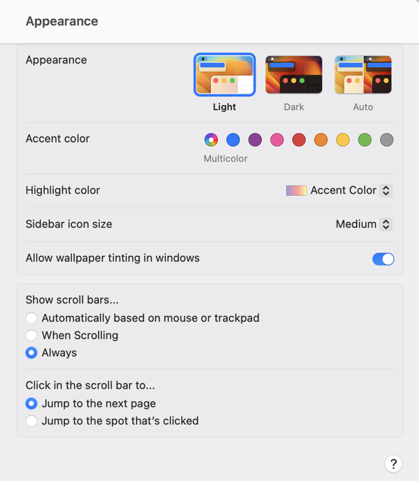
Screenshot of the macOS 13 Ventura System Settings Appearance tab

At first blush, there are apparent advantages to this design. Perhaps most significantly, the resemblance to iOS in both appearance and function may make the interface more navigable, and easier to understand, for users who are more familiar with iOS than with the Mac. The familiar “stack based” approach to delving deeper into the details of a particular preference pane has some advantages to the typical Mac approach of presenting detail as modal panels, which sometimes beg to be awkwardly nested in a pile of secondary or tertiary panels.

On second, third, and many blushes beyond, however, the design of System Settings appears to represent a major regression in overall usability and aesthetics. It has been taking public jabs since the first deveoloper beta, prompting a challenging question from John Gruber in his interview with Apple’s Greg Joswiak and Craig Federighi. Federighi replied with a compelling argument in favor of unifying the design experience across platforms, and removing historic cruft from the legacy macOS designs. Federighi further complained that Apple was being “judged for its betas,” implying that the UI would see significant improvements over the course of the summer.

We have seen improvements, but by the judgement of most Mac faithful (or at least the loudest among them), these improvements are not enough. Recently, a trending Twitter thread by Niki Tonsky reignited criticism, while many people pointed out that as the expected ship date for macOS Ventura draws closer, we are less likely to see dramatic improvements.

John Gruber returned to the subject in a piece yesterday, in which he asserts “the basic fit and finish of Ventura’s new System Settings is just bad.” He lays much of the blame for this on SwiftUI, which he further asserts that with SwiftUI “so many little layout details are apparently hard to get right.”

I have heard several people acknowledge that the successful transition to Apple Silicon was accomplished in part by focusing on the underlying architectural change while having the discipline to keep the hardware the same. The thinking is that with such a dramatic change in the underlying technology of the Mac, it would have been reckless to attempt other major hardware changes at the same time. In short: the Apple Silicon transition can be judged as successful on the basis that anybody using such a Mac might not even know they were using a fundamentally different computer design.

With Apple Silicon, Apple was able pull the proverbial table cloth out from under the exquisite place settings of the Mac, comprising its beloved hardware and software features, while leaving everything standing exactly as it was. That’s quite an achievement.

I think that SwiftUI would be judged as a more successful transition if Apple had pulled off a similar stunt. What if they had approached the challenge by making sure, first and foremost, that every Mac and iOS UI component behaved exactly the same as before? Then, as with the Apple Silicon changes, they could leverage the advantages of the new technhology to expand and improve upon the status quo, rather than attempting to replace it.

By choosing to change the underlying technology while also introducing new UI designs and behaviors, Apple has effectively attempted to pull the tablecloth out from under the place settings, while also pouring tea, cutting the cake, and serving the sandwiches. Messes will get made, some dishes are bound to get broken, and they’ll take a long time to put back together.
Catalina’s Custom Keyboard Viewers

Long-time Mac users will remember an app called “Key Caps”, which later become “Keyboard Viewer”, a feature of the Mac that is now accessible via the menu bar’s “Input Methods” item. If you’ve never played with this, I encourage you to enable it and check it out. Apple has detailed instructions for configuring the menu and these options.

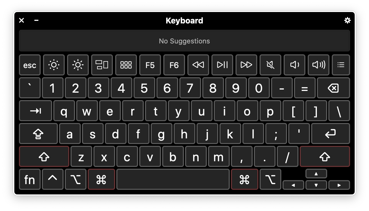
I don’t use the Keyboard Viewer often, but when I do, it’s a real life-saver. I brought it up recently while I was debugging an issue with keyboard shortcuts in FastScripts, my scripting utility app. The Keyboard Viewer not only reflects every bona fide keystroke you make on a hardware keyboard, but also allows you to simulate keystrokes by tapping on the keys of the on-screen keyboard.

On macOS 10.15 Catalina, Apple has evidently dramatically overhauled the Keyboard Viewer. I don’t see any hint of this on the Apple marketing sheet for the OS, but this is what the Keyboard Viewer looks like on my Mac now:

NewImage

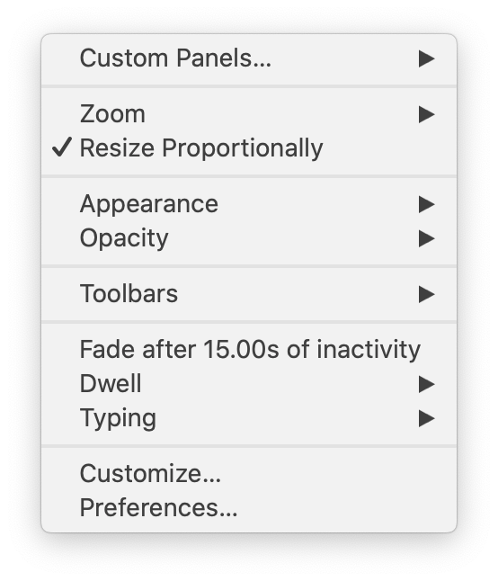
Well, isn’t that spiffy? But what I really want to talk about is that little Gear Button in the upper right corner of the window. Click it, and this what you get:

Popup menu with various options for customizing keyboards

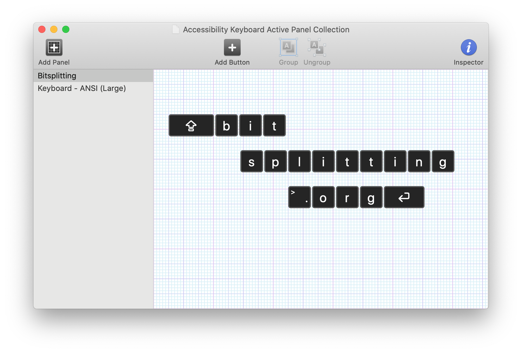
A whole slew of options for tweaking the behavior of the virtual keyboard, and an enticing “Customize…” item at the bottom. When you select it, a dedicated application called “Panel Editor” opens up. It’s essentialy a construction set for building virtual keyboard layouts:

Custom keyboard editor with silly bitsplitting.org keyboard layout

This example is obviously comical, but the point is you can create and layout tappable regions that correspond to whatever keystrokes you desire. The options for configuring these keys even include options to perform multiple keystrokes, open apps, run scripts, etc. It’s a powerhouse of utility superpowers.

How did they possibly find time to add all this great functionality in one OS upgrade? They didn’t. Folks who are familiar with Apple’s Accessibility Keyboard have no-doubt recognized my screenshots as being familiar from past OS releases. I personally had never seen it before, but it’s been hiding in the System Preferences Accessibility tab. What happened in macOS 10.15 Catalina is that Apple has evidently recognized its superiority in all ways to “Keyboard Viewer” and allowed the Accessibility Keyboard to simply take its place.

This is an excellent example of software being designed to assist people with specific needs, yet actually being useful to everybody. That is the heart of accessible software design, and I think we’ll see more and more “accessible” software released from the relative obscurity of the Accessibility tab as we move forward.

Paper Airplane Icons

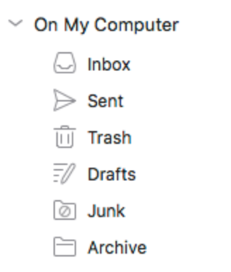
A friend who is running the latest beta of Microsoft’s Outlook 2016 for Mac shared a screenshot of the app’s sidebar icons:

PaperAirplane

The paper airplane used for “Sent” really jumped out at me, and I felt compelled to re-evaluate how common, and for how long, the metaphor has been used to represent a “sent email” in apps.

It seems obvious the metaphor is supposed to relate sending an email to the storybook notion of passing a note in class. Write your note on the paper, fold it into an airplane shape, launch it across the classroom, and hope against hope that you avoid the teacher’s gaze, aren’t ratted out by a classmate, and that you execute a perfect delivery so it doesn’t fall into the wrong hands.

Come to think of it, maybe this isn’t an icon that inspires confidence of a safe delivery. Nonetheless, I think it’s a pretty cute metaphor.

The app I most associate with paper airplane icons is the Mac’s built in Mail app. Apple uses a mix of metaphors in the app, including a postage stamp for the app’s main icon:

Apple Mail app icon.

and physical envelopes in the icons for some of its preferences:

Image of toolbar icons in Mail Preferences featuring physical envelopes

But when it comes to drafting and sending mail? It’s all about the planes. Notice how they even leverage the playful symbolism to represent a draft message with a paper folding diagram:

Image of Mail.app sidebar icons.

I was curious to know if another email app used paper airplanes to represent drafts before Apple Mail did. I went out Googling and found all manner of representations, usually employing the paper envelope, or another snail-mail related symbol. None of them, except Apple Mail, uses a paper airplane.

So my modest research suggests that the use of a paper airplane was a pretty novel bit of design. Was it an Apple innovation, or did it debut in some prior app I haven’t been able to track down? Is Microsoft’s adoption of the symbol the next step towards making paper airplane icons the universal symbol of sent mail? I kind of hope so!

Accessible Resistance

Accessibility in software refers to the noble ambition of ensuring that software is usable by as diverse a user base as possible. To that end, software is made more accessible by adapting to a variety of physical or cognitive impairments that may affect any individual user.

In the United States and other countries, there is an ugly trend towards supporting politicians who don’t believe that people from diverse backgrounds, or with specific impairments, should be accommodated by society as a whole.

Many developers are looking for concrete ways to fight these politicians who don’t value diversity and inclusion. One small thing we can all do to push back, to resist, is to ensure our own apps are as accessible as possible.

During my many years as an indie Mac developer, I have often prioritized accessibility in my apps. I have heard from many MarsEdit users, particularly those with vision difficulties, who tell me its accessibility makes it a better alternative to many other blogging solutions.

I am gratified to hear about the ways I have gotten accessibility right, but I am still not satisfied that I have done enough. There are nuances of MarsEdit’s accessibility that can yet be improved, while some of my other apps, such as Black Ink, are still hardly accessible at all.

If you are a Mac or iOS developer who is committed to improving the accessibility of your app, a great place to start is with the WWDC 2016 What’s New In Accessibility session. Apple is always enhancing the variety of accessible features that are built in to iOS, macOS, tvOS, and yes!, even watchOS.

Spend a half hour watching this video, and start getting up to speed with how you will enhance the accessibility of your app. No matter where you live in the world, you can be a strident voice for inclusion by declaring, through your actions in Xcode, that your software is designed to be used by everyone.

Progressive Disclosure In Swift

In his excellent interview with the Accidental Tech Podcast, Chris Lattner defended the goal of Swift being suitable to both beginner and advanced programmers. He cites progressive disclosure, a design philosophy that is often employed in GUI applications, to make otherwise intimidating interfaces appear approachable. From episode 205 of the show:

The secret to Swift in being easy to learn, easy to use as a teaching vehicle, but also powerful enough to solve the problems that need to be solved, is that the complexity in the language needs to be progressively disclosed.

This resonates particularly with me not only because I strive to make the same kinds of design tradeoffs in my own software, but because this concept is particularly important to the history of the Macintosh. Progressive disclosure as a user accommodation is intrinsic to most Mac and iOS interface design.

An example that anybody who uses a Mac can relate to is the process of deleting files by way of the Trash. There’s a file on your Desktop, and you want to get rid of it. A naive user who has never used a Mac before will soon learn how to drag the icon onto the trash, and how to empty it through a variety of discoverable UI buttons and menus. This is the Mac, it’s easy to use.

After gaining some experience the same user might start to find all that clicking and dragging tedious, so they’ll be delighted to learn that the cryptic symbols on commonly-used menu items represent keyboard shortcuts. To throw away a file and empty the trash, just select the file, press Cmd-Delete, and then Cmd-Shift-Delete. This is the Mac, it’s streamlined for productivity.

When the standard menu items and shortcuts don’t cut it anymore, the same user will be inspired by the variety of nuanced variations that are unlocked by holding the Option key while selecting menu items, and that the incorporation of the Option key into existing keyboard shortcuts often maps perfectly to the same menu item that appears when the key is held down. “Move to Trash” becomes “Delete Immediately,” and “Empty Trash…” becomes “Empty Trash”. The omission of the ellipsis, they have come to discover, indicates an action that will take place immediately, without additional interaction. This is the Mac, it’s kind of complicated, but great for power users.

Finally, finding cause to delete a variety of files from a directory selectively, based on pattern-matching, they discover the Terminal app. They teach themselves the basics of a decades old interactive shell scripting wildcard notation, and are off to the races invoking the “rm” tool with wild abandon. This is the Mac, it’s got god-awful, nasty interfaces for accomplishing just about anything.

I worked at Apple from around 1995 to 2002, so I had the pleasure of witnessing reaction both within and outside the company as we transitioned from Mac OS 9 to Mac OS X. The Terminal, as it happens, was one of the most contentious new features. Mac OS 9 had standalone command-line developer tools such as MPW (Macintosh Programmers Workshop), but it was a sort of point of pride that it didn’t ship with a Terminal app. This wasn’t DOS, for crying out loud! Many people complained that Mac OS X was too complicated, and that the inclusion of a Terminal app was the beginning of the end for the system’s famous usability.

Fifteen years later, people are still performing incredibly simple, incredibly complex tasks with macOS Sierra. It ships with a Terminal and it ships with a Trash icon. This is the Mac, it spans the spectrum from simplicity to complexity. Apple’s turns out to be pretty good at this, so they deserve the benefit of the doubt that they’ll achieve the same type of goal with Swift. It seems like they’re off to a good start.

Off By One Half

A friend was complaining that his wrist size falls more naturally between two size holes on his Apple Watch sport band. The holes are spaced so closely together that they don’t really give you an option of improvising an extra hole.

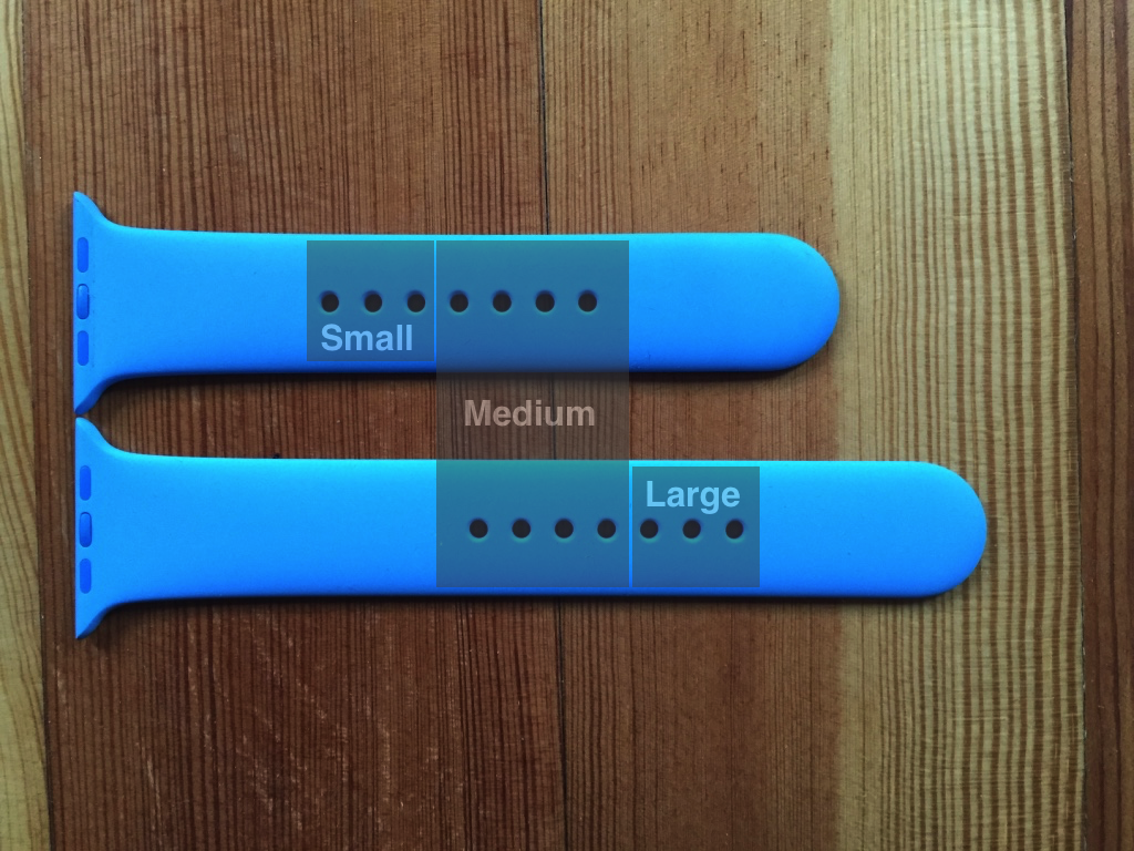
To increase the odds of a good fit, Apple includes two “holey” band segments with the Sport product: one for “Small/Medium” and one for “Medium/Large”. The natural result of this for many of us is that we get to choose which of the band segments to use. If you’re a “medium” then you’re likely using one of the last four holes on the smaller band, or the first four holes on the larger one:

Small, medium and large watchband holes on Apple Sport band.

I thought it would have been a supremely “Apple thing” to do if the holes that overlap, at the medium-sized positions, were carefully offset such that they were in fact half-sizes on one band in relation to the other. So, I drew lines through each of the holes’ (rough) centers, to see where the lines correlate on the opposing band segment:

Apple Watch Sport band hole alignment

Putting aside my imperfect placement of the watch bands on the floor, this is pretty interesting! Maybe not precise enough to indicate Apple intentionally designed it this way, but it’s convenient that the holes line up offset from one another. If your wrist size lands in the “medium” zone on the Sport band, switching from the “Medium/Large” to the “Small/Medium,” or vice-versa, could be just the adjustment to help fine-tune the grip of the watch to your wrist.

Update May 20, 2015: Jörg Schwieder on Twitter offered an insight that I hadn’t considered: the way the holes line up linearly on the floor is not a sufficient comparison because, in the case of the longer strap, the excess overlap that then slides under the counterstrap narrows the overall diameter of the band, such that it squeezes slightly tighter on your wrist.

I’m not sure if this exactly counteracts the size discrepancy of the hole placement. It’s possible the discrepancy was itself an intentional design to counteract this phenomenon. In any case, if you try to switch up from a small band to a larger band, and it feels a little snug yet, you might try trimming (egad!) the long end of the strap so that it creates less volume under the band when you tuck it away.

Another sizing hack this brings to mind is that, if you find something comfortable to glue to the underside of the non-hole half of the band, you would effectively increase the volume and tighten up an otherwise loose fit.

A Mockery Of Whom?

Are Marissa Mayer and Yahoo!’s design team playing the fools, or playing us for fools? I honestly am not sure anymore.

When the company announced more than a month ago that they would debut a new logo, I was surprised to learn that before sharing it with us, they would subject themselves and us to 30 days of lackluster logos. It felt to me like a lapse in judgement to:

  1. Put off for even a day the fresh new logo that was prepared to move the company forward.
  2. Accept for even a day, let alone 30, the use of any logo that had not made the cut.

But I sort of laughed it off, snidely and then crudely shared my thoughts on the matter, and waited out the 30 days.

Last night Yahoo! finally revealed the new logo, and the mildest reaction I can possibly muster is that it does not appear to be a professional design:

Yahoo's new logo, September 2013.

Because I myself am not a professional designer, I am tentative about making specific judgements, but my relatively untrained eye reacts to several problems with logo. The beveled characters make the logo appear dated and distractingly three dimensional. The scalloped edges lead the eye away from forming any unified shape. The lightness of the strokes, particularly in the bar of the A and H makes the whole thing feel fragile and not suited to scaling very large or very small.

A snarky summary of my criticisms would be to say that it looks like something somebody threw together in a weekend. Upon seeing the new logo I tweeted that I hoped it “was designed by committee, because I don’t want to imagine an individual taking the brunt of reactions.”

Marissa Mayer herself chimed in on the new logo, so now we know that both are true: it was designed by committee, and it was thrown together in a weekend:

So, one weekend this summer, I rolled up my sleeves and dove into the trenches with our logo design team: Bob Stohrer, Marc DeBartolomeis, Russ Khaydarov, and our intern Max Ma. We spent the majority of Saturday and Sunday designing the logo from start to finish, and we had a ton of fun weighing every minute detail.

Expletives are begging to let loose in my typing. You have to be kidding me.

This is not how any company, big or small, cherished or unknown should design a company identity. The more I read about Yahoo!’s process for this redesign, the less respect and confidence I have in them. As a minor Yahoo! shareholder and a long-time, sometimes grudging fan of the company, I am not sure where to go with these feelings.

It’s that point of gullible disbelief where one starts to look around for hidden cameras. Are we being punked? Is Marissa Mayer merely making a mockery of Yahoo! and its identity, or if she is snickering churlishly as she pulls off an elaborate prank, hi-fiving her co-conspirators as they witnesses the world react jaw-gapingly to their purported pride in these actions?